
Sketch Support #20 | Learn How to Use and Adapt Scrapbook Sketches | Day 4
- Allison
- Apr 29, 2021
- 4 min read

Once a month learn how to use scrapbook sketches and adapt them to fit different styles, photo sizes, and themes. Sketches = endless scrapbooking ideas with little effort. Sketches do all the heavy lifting allowing you to have all the fun!
Today, the sketch get a little rotation for a completely different looking design.
Here's the sketch that I have used as the starting point for each layout this week:

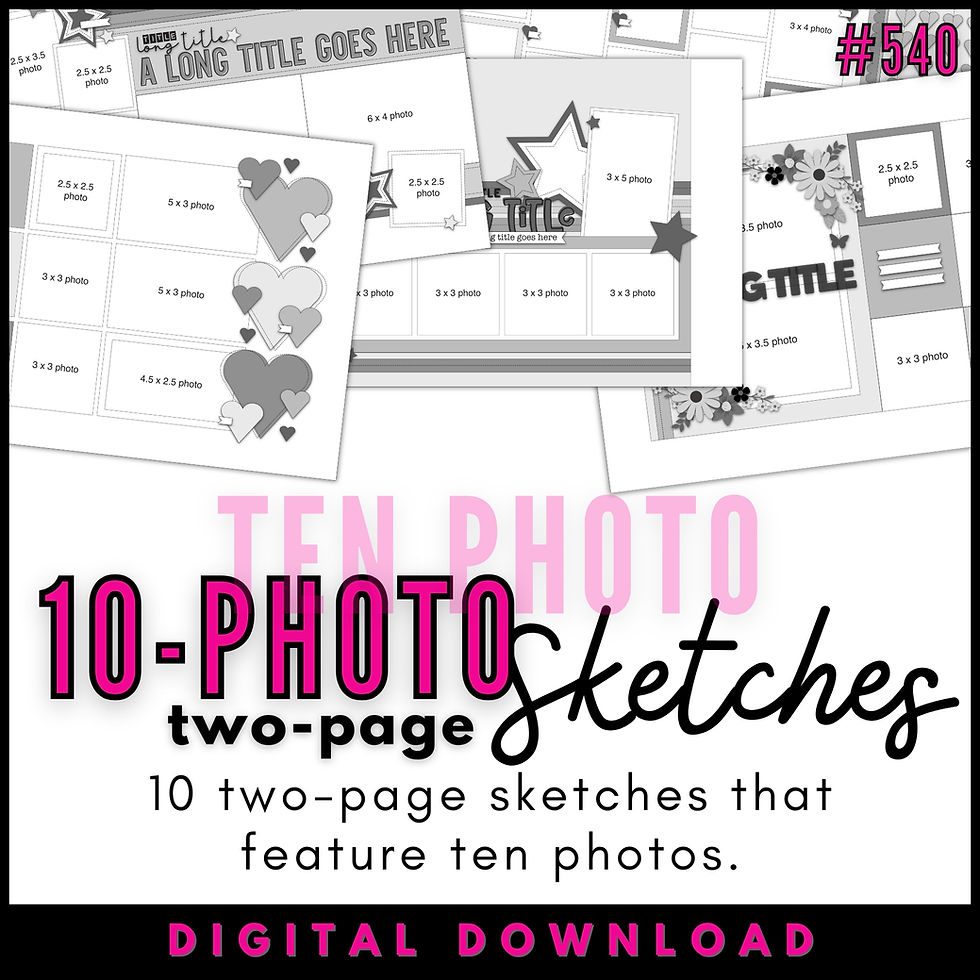
You can also grab the Sketch Support #20 Bonus Sketch Examples!

This month it is a 3-page PDF of 23 different sketch options. That makes 24 sketches for this month of Sketch Support. There are options that show how to change up the papers, use more photos, use less photos, use only 4 x 6" photos, there are four two-page options, and then an 8-1/2 x 11" option. The fun part is that you could use each option as a layout on its own, but you could also mix and match different options for endless possibilities!

Supplies used - Cardstock: American Crafts; Patterned paper, washi tape, stickers, chipboard pieces, "sweet" stickers: Simple Stories; Popsicles, "summer" word, and stickers: Pebbles Inc. Embroidery floss: DMC; Computer font: Century Gothic
Variation #1 & 2 - Rotating the sketch & Using a themed element in place of the horizontal banner strips.
Anytime I see a grouping of strips, like the horizontal banner strips on the sketch, I like to play around with different themes and find ways to customize those strips to the theme I want to use. I had these cute photos of Jackson enjoying his favorite summer treat and loved the idea of using popsicles in place of those banner strips. To make that work, I rotated the sketch so that those horizontal strips would become vertical strips.
I mentioned earlier this week that with horizontal strips I like to consider things that move or would be arranged horizontally and the same goes for vertical details. Rotating this sketch gives you an opportunity to transform those strips into different themed elements like - birthday candles, flowers, Christmas trees, or travel/road signs.
That's one of the things I love about this sketch. There are so many possibilities to customize it to different themes.
I had planned on create popsicles with my Silhouette but I came across these really cute popsicles in my stash. Talk about easy!

Variation #3 - Using different photo sizes.
The sketch has two wallet size photos with a square 2-12 x 2-1/2" photo. I used three wallet size photos and instead of arranging them in that triangle arrangement you see on the sketch, I have them all in a row.
Variation #4 - Using banner strips in place of the in place of a straight strip.
This striped paper is one of my all-time favorite striped papers. I love the colors, I love the rainbow order of the colors, and I love the thicker stripes. I used it on both sides of the larger strip in the middle. For the top side I used a 1/4" strip.

On the bottom side I used a 1-1/4" strip. I liked the idea of having banner strips along the bottom, but to save some time I created the illusion of individual banner strips by keeping the striped strip in tact and cutting the notches at the bottom of each color. It's banner strips with very little effort!

I knew I wanted to add a stitched border on these strips, but I wasn't sure what color I wanted to use. I had already used white on the white background, but I wanted to use a color on the stripe. After not being able to settle on just one color, I decided to use all the colors and stitch with coordinating colors on each color of the stripe. It took some extra time to do, but I'm really happy with the end result.
Variation #5 - Moving elements to better fit.
I moved my photos down a little more just to make sure I wasn't covering up too much of the popsicles. It seemed whenever I placed my photos overlapped on to those popsicles they really didn't look very popsicle-y. The easiest solution to move the photos down.

By moving those photos down I didn't leave myself with a lot of room for my title. It would have worked, but it would have needed to overlap onto my photos and I just didn't feel like the yellow "summer" word was standing out enough. An easy solution was to move it up to the top edge of the photos, slightly overlapped onto the popsicles.
I also moved my journaling to the top left edge of the layout and used a journaling block instead of strips. I liked using it in that corner to help balance everything a little better.

Variation #6 - Changing elements to better fit the theme.
To go with the popsicle theme I used lots of fruit embellishments. I have a mix of stickers, chipboard pieces, word/phrase stickers, and pieces cut from patterned papers.

Variation #7 - Adding extra strips.
The last change I made was adding a strip to the top and bottom of the layout. With the white background behind the popsicles and the white base paper, I wanted to add one more little pop of color to the edges.
That's all for day 4! Be sure to check back tomorrow for the last layout based on this sketch.
If you enjoy this sketch you might want to check out all of the sketches we have at Scrapbook Generation. There are tons to choose from!
And you won't want to miss the NEW upcoming class! The deadline to join ends soon on May 2!


It's a manually wound movement, but frankly, it strikes me so much more as a work of mechanical link art that it's link the first watch I've ever really admitted. I wouldn't care link if I even set the time. It's more about the experience of wearing it than anything else.
This gold BB58 is the sweet spot between robust tool-watch and aesthetic integrity that I am constantly searching for. No, it's not perfect. And no, I wouldn't pick a green dial and bezel for my personal yellow gold dive watch fantasy. But it works. The green melts into the link gold, it's a precious metal take on camo. It's rich and warm link and works perfectly alongside my daily link jewelry rotation.