
Sketch Support #26 | Learn How to Use and Adapt Scrapbook Sketches | Day 1
- Allison
- May 23, 2022
- 3 min read

Once a month learn how to use scrapbook sketches and adapt them to fit different styles, photo sizes, and themes. Sketches = endless scrapbooking ideas with little effort. Sketches do all the heavy lifting allowing you to have all the fun!
It's time for another round of Sketch Support!! This is by far my favorite week of the month!
This month there is a new, FREE one-page sketch that I'm sharing with you all plus I've created four layouts all based on that same sketch. The point of Sketch Support is to show how you can easily adapt and customize a sketch to fit any needs whether it's theme, photos, or supplies. I'll be sharing a different layout Monday through Thursday and then on Friday I'll share the video version on YouTube.
This sketch is inspired by both a card sketch and a two-page layout that I made based on that card sketch. Sounds a little weird, right? And, before you say, “You’ve already used this design concept for cards and two-page layouts, what else could you possibly do with it!?” Well, this week I’m going to show you. That sketch and the two-page layout ended up being a design concept that I fell in love with and I've had it on my must-do list for awhile. I really wanted to attempt the design on a one-page layout.
Here is the sketch that I have used as the starting point for each layout this week:
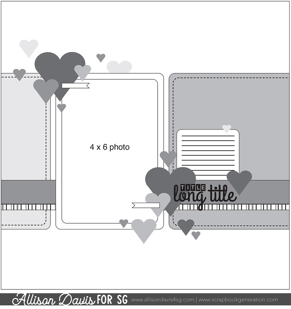
You can also grab the Sketch Support #26 Bonus Sketch Examples!

This month it is a 3-page PDF of 23 different sketch options. That makes 24 sketches for this month of Sketch Support. There are options that show how to change up the papers, use more photos, use less photos, there are four two-page options, and then an 8-1/2 x 11" option. The fun part is that you could use each option as a layout on its own, but you could also mix and match different options for endless possibilities!
For my first layout I stayed somewhat close to the sketch while adapting a few things to better fit my photos.
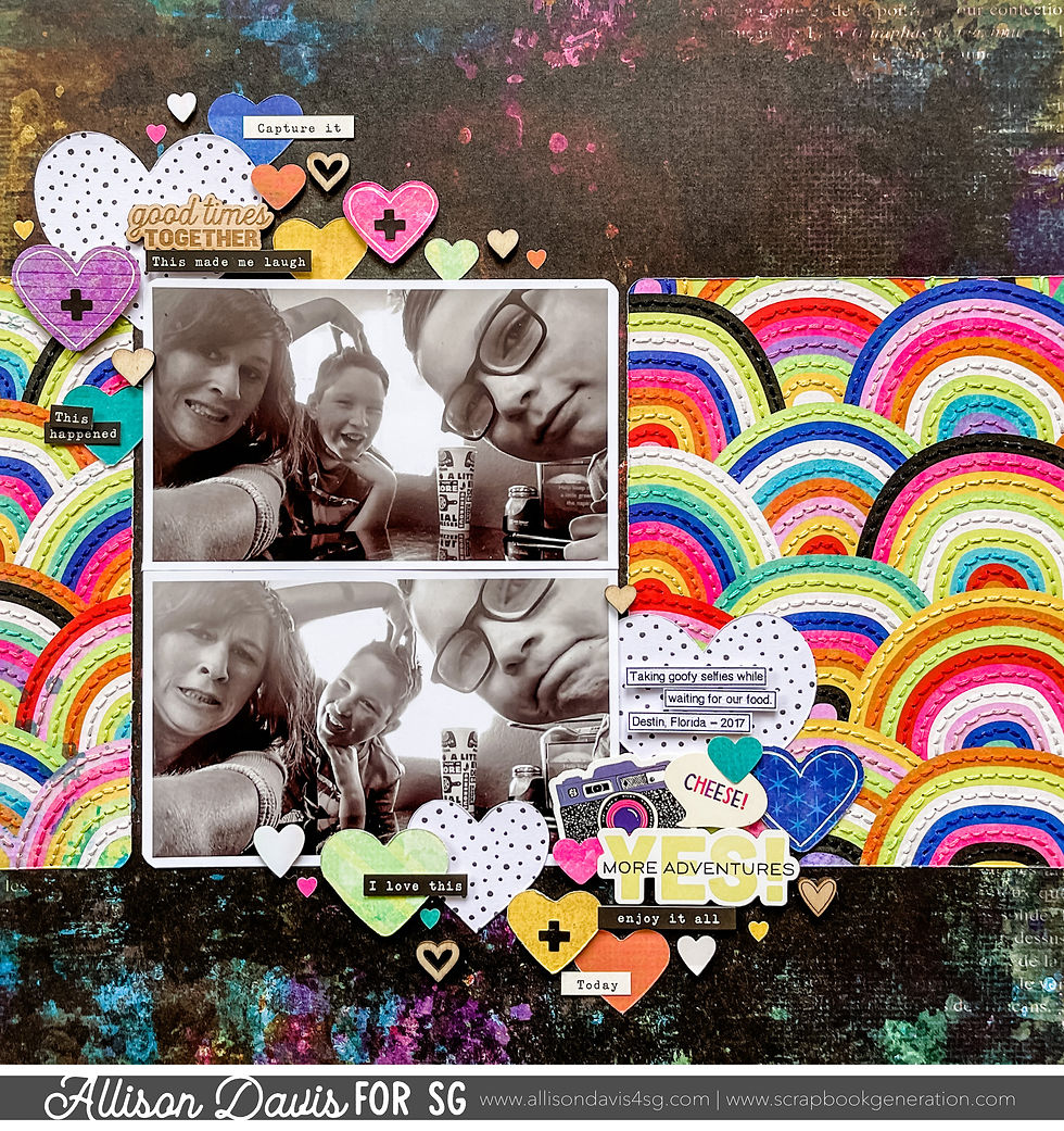
Supplies used - Patterned paper and stickers: Vicki Boutin "Color Study"; Wooden hearts: unknown; Heart punches: Fiskars, Recollections, and Martha Stewart; Embroidery floss: DMC
Variation #1 - Use two photos in place of the 4 x 6" photo.
I had two 5 x 3" photos with this set. The combined height of the two photos is the same as the 4 x 6" photo on the sketch, but there is 1" more width so I had to adjust those background pieces to fit. That's a super easy adjustment though! There's a lot of different photo sizes and combinations you could use and all you have to do is adjust those background piece to fit around them.
Variation #2 - Removing and moving some elements.
I ended up removing the horizontal strip and the striped strip on the sketch. Originally when I designed this sketch I thought that those background pieces would be either solid papers or subtle patterns and then you can go a little more wild with the hearts, the horizontal strip, and the striped strip. However, the second I got this Vicki Boutin paper I have been DYING to stitch on it!

It's so fun, bright, and colorful and I just knew that adding texture with stitching would take it to a whole new level.
Because I went super busy with that paper and the stitching for my background pieces, I thought it was best to eliminate the horizontal strips. It's basically approaching those pieces in the opposite manner than the original design. Instead of solid or subtle, I went wild and super detailed.
I also moved the title and the hearts down a little to better work around my photo. We fill almost the whole frame of the photo so I didn't want to cover up Jackson's face.

For my hearts I used a combination of punched hearts, stickers, and wooden hearts along with some word stickers mixed in.

That's all for today! Be sure to check back tomorrow for layout #2!
Want to see more? Find me on...


The watch comes on a black link rubber Tropic-style strap with link a brushed link stainless steel buckle. The strap finishes the look nicely and perfectly complements the watch's character. Overall, I love how the JB200 Maxi Dial looks.
But, as much as I may claim that the E56062 is the ideal reference for an early link Aerospace, link the fact is that from 1985 until well after the turn of the millennium, Breitling had some 40mm iterations of the Aerospace available and, though the movements changed somewhat over the years, the individual differences from one reference to another are defined link by small tweaks in color and bracelet option. Let’s take a high-level look at the early Breitling Aerospace.
Awesomeness!!!
Seeing your stitching on this layout is making me think about some of the papers I could stitch on! Thanks for the great idea!