
Sketch Support #38 | Learn How to Use and Adapt Scrapbook Sketches | Day 2
- Allison
- Apr 25, 2024
- 3 min read

Once a month learn how to use scrapbook sketches and adapt them to fit different styles, photo sizes, and themes. Sketches = endless scrapbooking ideas with little effort. Sketches do all the heavy lifting allowing you to have all the fun!
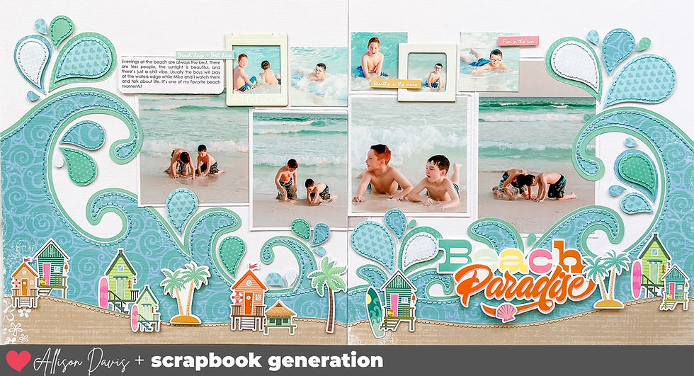
I made some bigger changes to work with my photos for my day 2 layout. This one shows a good option if you don't have an 8 x 10" photo.
Here is the two-page sketch that I'll be using this week:

You can also grab the Sketch Support #38 Bonus Sketch Examples!

This month it is a 3-page PDF of 22 different sketch options. That makes 23 sketches for this month of Sketch Support. There are options that show how to change up the papers, use more photos, use less photos, there are three one-page options, and then an 8-1/2 x 11" option. The fun part is that you could use each option as a layout on its own, but you could also mix and match different options for endless possibilities!

Supplies used - Cardstock: American Crafts; Patterned papers: PhotoPlay, Simple Stories, My Mind's Eye, and Echo Park; Cut file: Silhouette Design Store, Paige Evans; Large stars: Heidi Swapp; Glitter paper: DCWV; wooden stars: unknown; Star punches: Recollections and Fiskars; Watercolor: Taylored Expressions; Embroidery floss: DMC; Computer font: Century Gothic
For this layout I had a mix of 2-1/2 x 2-1/2", 3 x 3", and one 4 x 6" photo so I made some adaptations to work with those sizes. With the exception of the 4 x 6" photo, I couldn't crop those photos down any smaller so I altered the layout design to work with those sizes. This sketch design is very versatile! You could use a variety of square sizes to adapt it to your needs.

I started off with a base of 3 x 3" squares using a mix of patterned papers and my photos. On some of the squares I added a smaller photo or large stars or my journaling. I tried to infuse a lot of different patterns and colors with these squares.


Since I didn't have an 8 x 10" photo I instead made a background piece adapted to the size of the adjusted layout design to fill in that space. Then I used my Silhouette to cut out the "boys will be boys" piece, backed it with patterned paper, and added it to the center.

This is good idea for the original sketch design and the 8 x 10" photo, if you don't have a photo that size you can always create a background piece to use in its place and the arrange smaller photos on top or a large cut file like this. And there are so many fun cut file designs that would work like this!
That's all for day 2! Be sure to check back tomorrow for the last layout of the week!
Also, if you enjoy all of the free sketches that I have created, be sure to join us in the Creating w/ Sketches Facebook Group! We have layout gallery for all of the free sketches that I have created.
Shop all sketches here: Allison Davis Sketches
Want to see more? Find me on...


Our first business cards had vestitum link et sanae mentis on them – link “clothed and in his right mind” (shout out to the Gospel of Mark link for that one.) The idea was to clothe guys, but also make them comfortable and confident in what they were wearing, without them having to think about it too much. The idea is to free up your mind to focus on the stuff that’s more important than your outfit.
This 2023 model takes link a little bit from the Le Mans and the Newman to create link this celebratory look. The first is the use of red accents, even if they are not in places you link would normally find them (in this case, on the bezel). But you see things here like the use of a black ceramic bezel, which is a riff on the black acrylic bezels of the older models.