


Sketch Support #48 | Learn How to Use and Adapt Scrapbook Sketches | Day 1

Once a month learn how to use scrapbook sketches and adapt them to fit different styles, photo sizes, and themes. Sketches = endless scrapbooking ideas with little effort. Sketches do all the heavy lifting allowing you to have all the fun!
This sketch this month features a go-to design concept that I love using with two-page layouts. One side has more detail and the second page follows a more simple design. To me it's a great balance between having some fun without overwhelming the page.
Here is the two-page sketch that I'll be using this week:

You can also grab the Sketch Support #48 Bonus Sketch Examples!

This month it is a 3-page PDF of 22 different sketch options. That makes 23 sketches for this month of Sketch Support. There are options that show how to change up the papers, use more photos, use less photos, there are three one-page options, and then an 8-1/2 x 11" option. The fun part is that you could use each option as a layout on its own, but you could also mix and match different options for endless possibilities!
I really came out with a bang for this first layout! I made a lot of big changes to fit different photos and wanting to include more detail.

Supplies used - Cardstock: American Crafts; Patterned paper, chipboard "legit" and "fun", and stickers: Bella Blvd.; Black star stickers and arrows: American Crafts; Chipboard frame: American Crafts; Word/phrase stickers: Bella Blvd. and Simple Stories; Embroidery floss: DMC; Computer font: Century Gothic
Variation #1 - Extending the design to the outer edges of the layout.
Because of the photos I had to use, I decided to extend the design to the edges of the layout. This was a much better fit for the photos I had, especially since several of the photos could not be cropped any smaller to fit the sketch design.
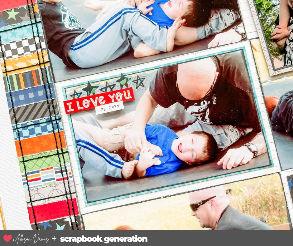
Since most of my photos were 6 x 4", I created a photo block on the right page that has six 6 x 4" pieces. Three of them are the full 6 x 4" photo while the other three include mats or a background. Since the photos are all similar and limited in color I felt like mats and background helped to show off each individual photo. I also added a black painted frame on each photo.

Since I extended the photo block on the right page to the edges I did the same for the strips frame.

Variation #2 - Changing the strips frame to include more detail.
In the beginning I had planned on creating the strips frame as it is on the sketch, but as I was laying it all out I was craving more. I loved this "Teen Boy" collection from Bella Blvd and wanted to include as many patterns as I could. One option could have been adding more strips, but I really wanted to include the white space inside the frame and adding more strips would reduce that too much.

The second option I came up with was using 1-1/2 x 1/2" strips to create the frame. On the left and right side the strips are horizontal and on the top and bottom they are vertical. They also follow the same arrangement of the strips by only going to the edge on one end.

The 1-1/2" width is the same width as the original frame design.
Variation #3 - Changing the photo sizes on the left page.
I adapted the left page design to work with horizontal photos instead of the two vertical photos on the sketch. I still used the same sizes, they are just rotated to work with horizontal photos.

For the title and journaling, I kept things as they are on the sketch.
That's it for today! Be sure to check back tomorrow for my second layout using this sketch!
Shop all sketches here: Allison Davis Sketches
Shop all cut files here: SG Cut Files
Want to see more? Find me on...


Comments