
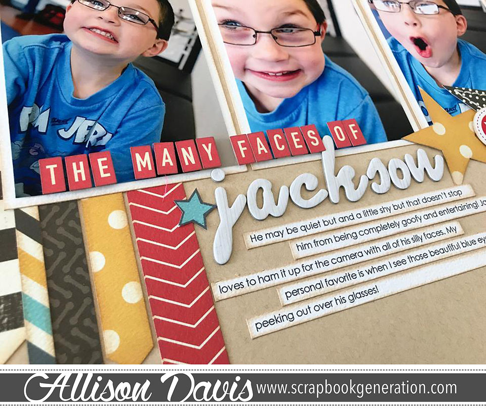
"The Many Faces of Jackson" and Slanting a Design
- Allison
- Feb 26, 2019
- 2 min read


Every once in a great while I get the urge to do something different just for the sake of doing something different. One of my go-to “do-something-different” things is to slant the design on my layout. It’s not anything revolutionary and I’m not trying to claim the bragging rights to being the first person to use a slanting design. It’s just a fun go-to for something unconventional.
I remember one time I put together a layout for Creating Keepsakes for an article they had requested me to do a layout for and I thought it would be fun to mix it up by slanting the design. The response I got was basically “it doesn’t make sense to slant the design so we just don’t get it.” My layout was rejected and I was asked to straighten my layout. Of course I wasn’t going to tell the editor that I thought she was the one not making sense, so I complied and straightened my design.
Honestly, I think it’s fun to not make sense sometimes. Especially when it comes to creating. Maybe there isn’t a specific or deep meaning for the slant, but that’s okay. Or at least that's the way I see it.
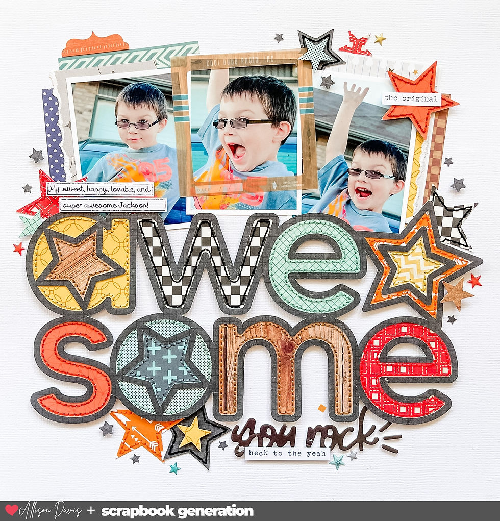
However, if you agree with the CK editor and you need the slant to make “sense,” try using a slant for progression pictures or a series of movements going across the page. To me, on a scrapbook page, a slant looks like a climb across the layout.
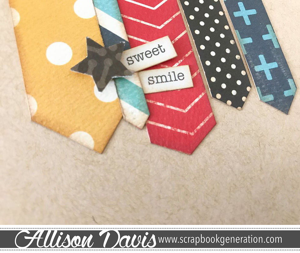
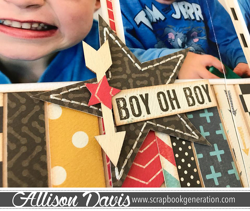
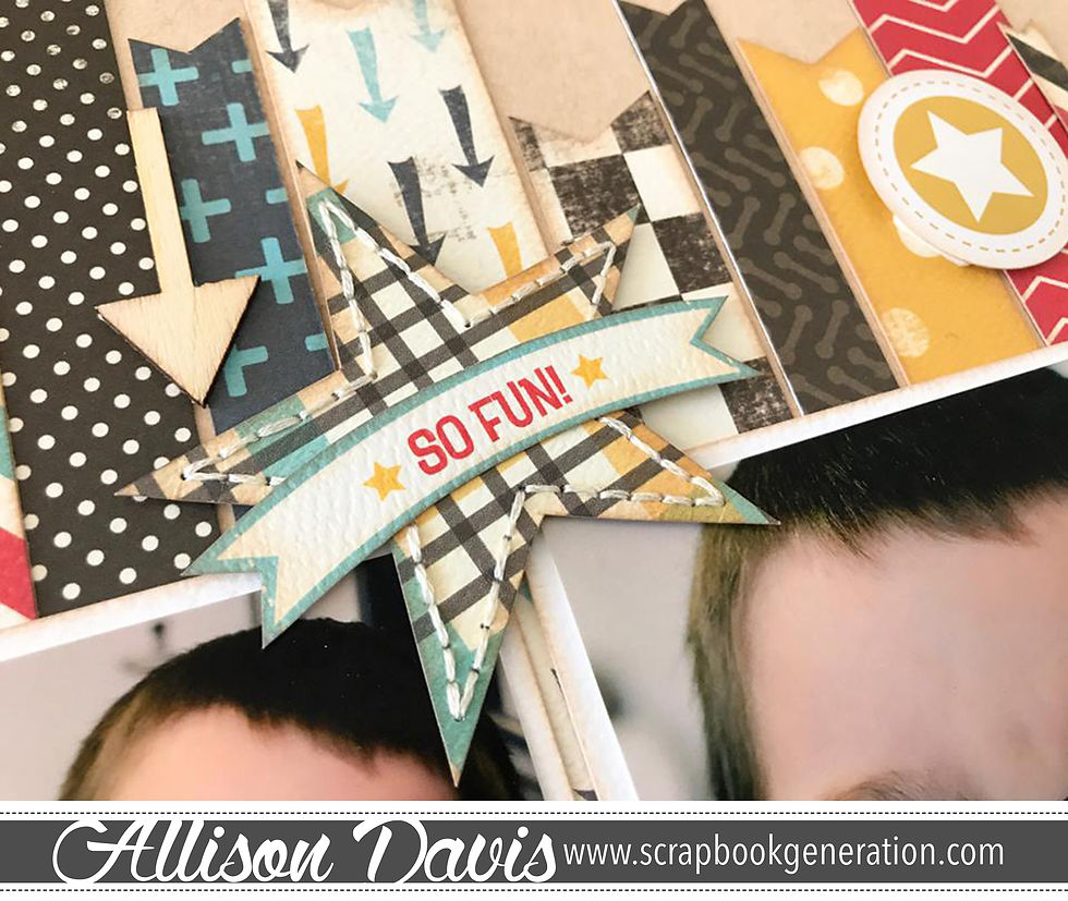
As someone who uses sketches a lot, I think slanting a design is another way to change up the look of the sketch without a lot of extra effort. This works perfectly when you have a sketch you really like and use often, but want to give it a fresh look.
Have you ever slanted a design? What was your reason for slanting it? If you don’t like a slanted design, why is that?


I find this idea intriguing. Thank for the idea, the challenge of slanting, tipping, flipping and turning.