
Sketch Support #15 | Learn How to Use and Adapt Scrapbook Sketches | Day 2
- Allison
- Nov 24, 2020
- 4 min read

Once a month learn how to use scrapbook sketches and adapt them to fit different styles, photo sizes, and themes. Sketches = endless scrapbooking ideas with little effort. Sketches do all the heavy lifting allowing you to have all the fun!
For my day 2 layout I adjusted the sketch to work with all 4x6/6x4" photos.
Here's the sketch that I have used as the starting point for each layout this week:

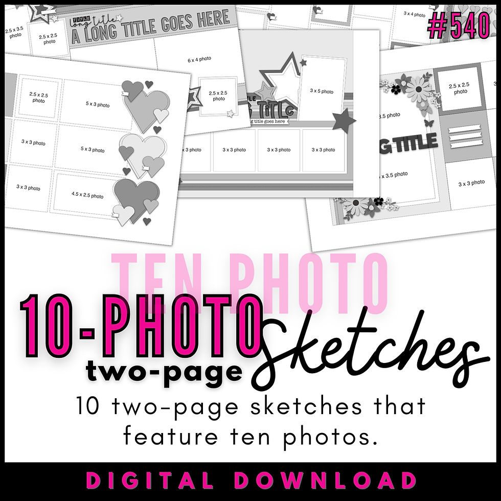
You can also grab the Sketch Support #15 Bonus Sketch Examples!

This month it is a 3-page PDF of 22 different sketch options. That makes 23 sketches for this month of Sketch Support. There are options that show how to change up the papers, use more photos, use less photos, use only 4 x 6" photos, there are three one-page options, and then an 8-1/2 x 11" option. The fun part is that you could use each option as a layout on its own, but you could also mix and match different options for endless possibilities!

Supplies used: Cardstock: American Crafts; Patterned papers: Echo Park; Glitter foam alphabet stickers: American Crafts; Glitter paper: American Crafts; Die cuts and sticker: Echo Park; Embroidery floss: DMC; Computer font; Century Gothic (for journaling) and Montserrat Alternates Black (for title word "thinking")
Variation #1 - Using 4x6/6x4" photos in place of all photos.
I had this set of photos that were all printed in 4 x 6 or 6 x 4" and I could see that it wouldn't take a lot of adjustments to this sketch to make it work with those photo sizes.
First, two of the 6 x 4" photos fit perfectly in place of the three 3 x 4" photos and the 3 x 4" card/rectangle. They are all the exact same measurements as a whole.
For the third 6 x 4" photo I had, I used it in place of the three 2 x 2" photos that are peeking out from behind the 3 x 4" photos. In total, both options cover a 6" width so it was an easy substitution.

That left me with two 4 x 6" photos. There is already one on the sketch, all I did was double it.
I did make a few more adjustments to the sketch to accommodate the difference in photos...
Variation #2 - Extending the design to the left and right edges.
This was a bigger adjustment I made to work with the different photo sizes and I did this for a few different reasons.
Looking at the left page, I was using a 6 x 4" photo in place two 3 x 4" photos. On the sketch, one of those 3 x 4" photos is on the right page. If I followed the sketch for the placement of my 6 x 4" photos, that means I would have to cut a 6 x 4" photo into two pieces and split it between the two page. I'm not really a big fan of splitting photos like that, especially when it is cutting right into the middle of a photo. Because of this, I decided to shift everything (the strips and photos) over to the left page.
Looking at the right page, I had two 4 x 6" photos that wouldn't quite fit on the background you see on the sketch, PLUS, I wanted to maintain balance on the layout so I decided to extend that piece to the right edge.
Because I used this large, single patterned paper for the background, I decided to add a little more detail to it by adding some hand-stitching around a few of the stars.

You can see throughout my layout that I use red and orange which matches the red and orange in my photos. I thought adding some red into the orange background paper would help me highlight that color combo.

Variation #4 - Changing the size of the elements to better fit your needs.
The first change I made to the size of the strips and background piece on the right page is adding an extra inch of height. On the left page, the 6 x 4" photo that I used in place of the three 2 x 2" photos on the sketch has double the height of those photos on the sketch.

An easy solution to accommodate that was to add a little extra height to my strips. To match the height of the strips, I added an inch to the background piece on the right page as well.
The second change I made was to the width of the strips. I love this paper collection from Echo Park, but there really weren't a lot of patterns that I wanted to use with this layout. Some of them had themes that didn't quite go with my theme and there are a lot of busier patterns and I didn't want to overwhelm that area. Plus, I really wanted to focus my color combo on the red and orange you see in my photos. My solution was to use three 3" strips with a 1/2" strip on top of each one and then I used three 1" arrow strips to fill in the remaining 3" area.
The strips section on the sketch can easily be adapted to fit any number of strips you want to use. You can go from tiny 1/2" strips all the way up to a solid 12 x 8" piece. You could use strips of all one size or you can mix and match with a variety of sizes. You could even use horizontal strips. There's really a lot you can do with that area to change up the look or customize it to fit what you have or need.
That's all for day two! Check back again tomorrow for another layout!
Want to see more? Find me on...


I'm struck by how much these seem to iterate on the SKX style, only with a traveling bent. And it looks like Seiko link is more than keenly aware of that. In fact, the brand is link referring to this watch in some of the materials as the "SKX Sports Style link GMT series." It doesn't get more overt than that.
Like other pieces within the DS-1 Big Date collection, the new releases use 41mm by 48.5mm 316L stainless steel link cases. The watches are 12mm link thick link and include a curved sapphire crystal with an anti-reflective coating.