


Sketch Support #47 | Learn How to Use and Adapt Scrapbook Sketches | Day 2

Once a month learn how to use scrapbook sketches and adapt them to fit different styles, photo sizes, and themes. Sketches = endless scrapbooking ideas with little effort. Sketches do all the heavy lifting allowing you to have all the fun!
For my second layout with this sketch I made some adaptations to accommodate some different photo sizes.
Here is the one-page sketch that I'll be using this week:

You can also grab the Sketch Support #47 Bonus Sketch Examples!

This month it is a 3-page PDF of 23 different sketch options. That makes 24 sketches for this month of Sketch Support. There are options that show how to change up the papers, use more photos, use less photos, there are four two-page options, and then an 8-1/2 x 11" option. The fun part is that you could use each option as a layout on its own, but you could also mix and match different options for endless possibilities!

Supplies used - Patterned paper: Simple Stories; Chipboard speech bubbles: Pebbles Inc.; Acrylic film strip frames: 49 & Market; Alphabet stickers: BasicGrey; Foam "yay!" and stars: Simple Stories; Wooden stars: unknown; Embroidery floss: DMC; Computer font: Century Gothic
Variation #1 - Adapting the design to different photo sizes.
I made some big changes with the photos arrangement for this one! With this set of photos I had two 6 x 4" photos and three 2 x 2" photos. I don't know what I had in mind when I had edited and cropped these photos years ago, but I do know that when I came across them I knew I could make it work with this sketch design!
I place the two 6 x 4" photos (with mats) in a row that reaches the left and right edges of the layout. Then I added a row of 2 x 2" photos and squares along the top that also go to the left and right edges of the layout. Unintentionally, this block ended up being the same height as the block of squares and photos on the sketch so I didn't need to make any major adjustments for this to work within that same space.
Variation #2 - Changing the details to fit the theme.
I happened to come across these chipboard speech bubbles that were so perfect for this theme! I worked to include them in several areas on the sketch. I used one for the title, one for the journaling, and two more to add embellishments to on the squares.
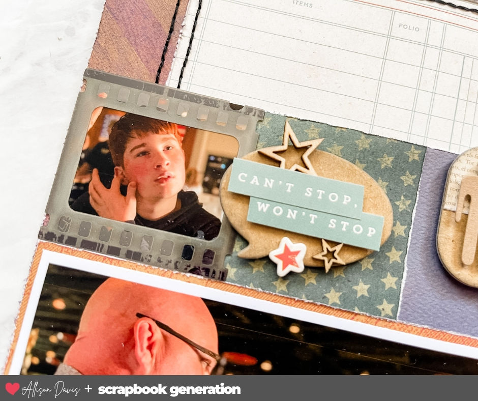
I added different embellishments like stars, word/phrase stickers, and two male figurines.
Variation #3 - Moving the title and journaling to work within the design.
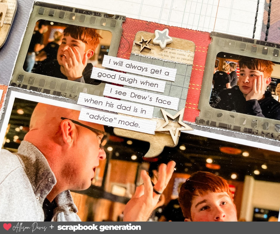
I moved the journaling to one of the squares on the right. I need that larger speech bubble for the journaling and I liked how Mike is speaking in that photo. I thought that would be a fun little detail!
I also moved my title. Again, I like the idea of the speech bubble becoming a part of the photo so that placement felt like a good fit.

That's all for today! Be sure to check back tomorrow for layout #3!!
Shop all sketches here: Allison Davis Sketches
Shop all cut files here: SG Cut Files
Want to see more? Find me on...


audiveris provides an indispensable bridge between physical musical manuscripts and modern digital composition tools. Your website breaks down complex recognition filters and output configurations into straightforward, actionable steps for musicians everywhere. I am truly grateful for your high-quality documentation and ongoing commitment to musical technology resources.
greenluma offers powerful options for managing complex digital gaming libraries, and your website explains its functionality with outstanding technical professionalism. The thorough walkthroughs and proactive safety precautions provide users with complete peace of mind during configuration. I greatly appreciate your consistent focus on delivering dependable, high-value software documentation.
Nonsteamlaunchers makes integrating alternative gaming launchers into Steam Deck and desktop Linux an absolute breeze for players everywhere. The automated installation pipeline, clear troubleshooting advice, and enthusiastic developer updates on this platform are top-notch. Thank you for dedicating your time to simplifying handheld gaming for thousands of enthusiasts.