
A Layout That Inspired a Sketch
- Allison
- Jun 3, 2025
- 1 min read

Most of the time when I create, I start with a sketch and build my layout based on that. But, sometimes the opposite happens and I start by creating a layout and then later build a sketch based on that.

Supplies used - Cardstock: Simple Stories and American Crafts; Patterned papers: PhotoPlay, Simple Stories, and Bella Blvd.; Acrylic "happiness" title: Color Cast Designs; Stickers: PhotoPlay; Alphabet stickers: Elle's Studio and My Mind's Eye; Splash droplet cut file: Cut Files by Allison Davis; Embroidery floss: DMC; Computer font: Century Gothic
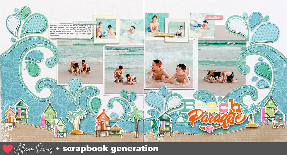
I was asked to create a two-page layout for the Spring/Summer issue of Scrapbook & Cards Today magazine and this is what I came up with. I started off with these super fun photos of Jackson chilling on Floyd the Flamingo, our pool float.

I really wanted to create a large, colorful splash design as an accent on the layout and after playing around with a few compositions, this is what I came up with.


I ended up loving the layout design so much that I knew I had to include it in my newest Sketches for a Water Theme: Two-page sketch set. It was just too fun not to share with others!

You can get the Water Themed two-page and one-page sketch sets here...
Want to see more? Find me on...


The Macedonian font has a unique and cultural flair that makes it stand out from standard fonts. I used macedonian font on an art project, and it instantly gave a distinctive feel. It works well for titles and decorative text where you want something special. I appreciate how legible it still is despite its unique style. For anyone looking for a font that combines tradition with modern readability, Macedonian is definitely worth exploring.
LOVE the paisley designs! Cute kiddo too!