
"Born to Stand Out" and Using Black and White Photos
- Allison
- Mar 26, 2019
- 1 min read


Drew has been the star of my layouts this month so I might as well continue that trend.
Have you ever looked at a photo and while you do love it, the colors just aren’t right?
As I’ve practiced more and gotten older, my photography has definitely gotten better, but sometimes, when I go back to older photos in those days when I was just starting out with my camera, I ended up with bad photos a lot. Not bad, bad. Just the colors aren’t that great and editing just doesn’t seem to help. Or sometimes it’s not the photo quality that sucks, I just don’t like the colors in the photos, like the background or the clothes clash.

Whenever this happens, I happily click the black/white option, and use what ever papers I want without worry about colors clashing or the photo quality being wonky. It’s a super easy fix, and for me, I enjoy working with black and white photos from time to time.

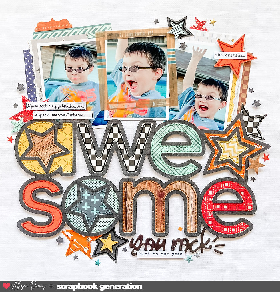
In the case of this layout, I felt like converting to black and white helped the glasses in my photos stand out more. That's a big win since they were the focus of the layout.
Do you ever use black and white photos? Do you enjoy using them? Why or why not?


Comments