
Scrapbooking Quick Tip: Using Black and White Photos and Color Photos on the Same Layout.
- Allison
- Jul 14, 2020
- 2 min read


Supplies used: Cardstock: Bazzill; Patterned papers: Creative Imaginations (I'm not 100% sure that it is Creative Imaginations, because I no longer have any of this paper, but that is my best guess.); Chipboard alphabet: American Crafts; Alphabet stickers: My Little Shoebox; Computer font: Century Gothic
Let me tell you, this paper made creating this layout a breeze! All I had to do was put together a large photo block in the center and let the paper shine with the guitar and music notes going across the bottom. I love it when things come together so quickly!

For the photos on this layout, I used a mix of photos from two different settings. Most were taken at Drew's school during his kindergarten concert, but a few were taken at home to capture his rock star costume up close. Because of the two different settings, I had photos that didn't quite match in color. Now, I don't expect everything to match perfectly all of the time, BUT it was very distracting to have all of the green grass in the photos. I loved the patterned paper and how well it coordinated with the school colors and I really wanted to keep that look on the layout.
Easiest solution? Convert the photos that didn't coordinate as well to black and white.
Not only is this an easy way to cut out colors you don't want on your layout, it's always a great way to highlight a few of your favorite photos. Plus, sometimes some photos can be completely transform when converted to black and white. It's like some photos were just meant to be that way.
Here's a closer look at a few of the layout details:

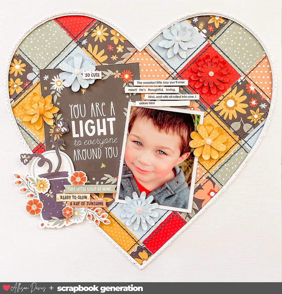
Pretty much all of the accents and embellishments were cut out of patterned papers.

Want to see more? Find me on...


Newer companies, those link hoping to make waves in link an entrenched industry with evermore trenchant ideas, frequently lack the budget to cause link the kind of stir they believe their enthusiasm and vision deserve to sire.
Lucky for Casio, the link Databank would prove to have a much longer tail than the Blackberry. The Databank's progression from modernity to obsolescence (and back) may have challenged the usefulness of those extra features, but the piece link remains roughly as appealing link as ever. And I haven't even gotten to the price.