
Sketch Support #24 | Learn How to Use and Adapt Scrapbook Sketches | Day 1
- Allison
- Mar 28, 2022
- 4 min read

Once a month learn how to use scrapbook sketches and adapt them to fit different styles, photo sizes, and themes. Sketches = endless scrapbooking ideas with little effort. Sketches do all the heavy lifting allowing you to have all the fun!
I'm doing my little sketch happy dance! It's time for another week of Sketch Support! Yay!!
This month there is a new, FREE one-page sketch that I'm sharing with you all plus I've created four layouts all based on that same sketch. The point of Sketch Support is to show how you can easily adapt and customize a sketch to fit any needs whether it's theme, photos, or supplies. I'll be sharing a different layout Monday through Thursday and then on Friday I'll share the video version on YouTube.
This sketch was super fun to create with and I hope you all enjoy it as much as I did!
Here is the sketch that I have used as the starting point for each layout this week:

You can also grab the Sketch Support #24 Bonus Sketch Examples!
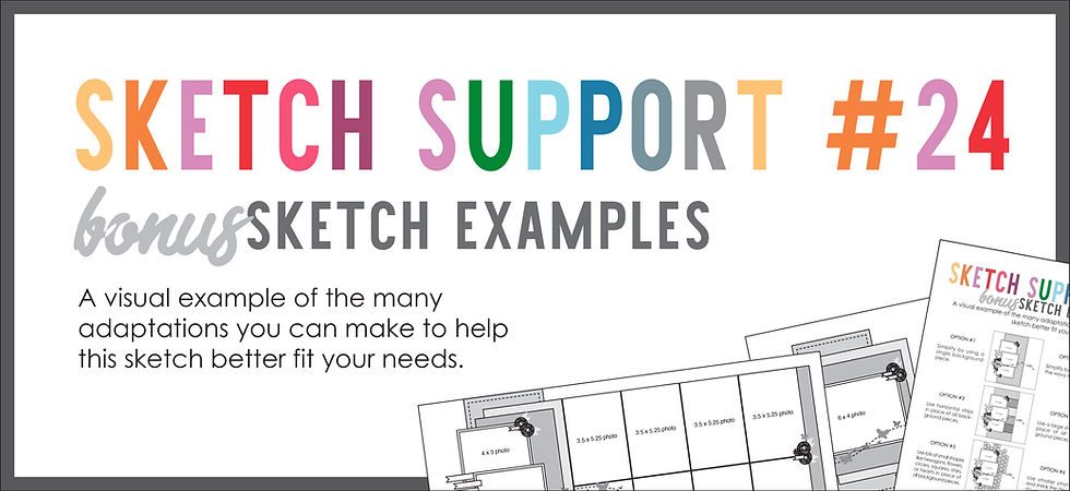
This month it is a 3-page PDF of 23 different sketch options. That makes 24 sketches for this month of Sketch Support. There are options that show how to change up the papers, use more photos, use less photos, use only 4 x 6" photos, there are four two-page options, and then an 8-1/2 x 11" option. The fun part is that you could use each option as a layout on its own, but you could also mix and match different options for endless possibilities!

Supplies used - Patterned paper, die cuts, stickers, photo frames: Kaisercraft; Airplane stickers: Simple Stories; Wooden airplanes: BasicGrey and Simple Stories; Chipboard speech bubbles: Pebble's Inc.; Alphabet stickers: Simple Stories, Elle's Studio, and unknown; Word/phrase stickers: Simple Stories; Embroidery floss: DMC
I made a lot of minor changes while still following the sketch closely.
Variation #1 - Using different photo sizes.
With this set of photos I had three 3 x 3" photos. The paper collection I used came with three Polariod-style frames so I decided to use them and thought they would work well with this sketch design. One was smaller so I cut my photo down to fit. This gave me a similar, yet different grouping of photos. While they are arranged the same way, they lack the width that the original photos on the sketch do, but that was an easy alteration to accommodate and didn't really affect the design.
I tried to be strategic with the arrangement of my photos. I put the plane photo in the middle so that the bottom one is of Jackson pointing to the plane. Then at the top I used the one of him looking up and positioned an airplane right in his line of view so it looks like he is looking at the plane on the layout.

With this collection I had two large die cut ticket pieces that had a quote in the center.

The die cut piece was almost the perfect size for that background piece and I loved the look of the decorative edges, but I didn't want the quote and globe to show. I decided to go ahead and use it in place of the top background piece and find a way to cover the middle.
My photos covered part of it, but there was still some of the words peeking out to the right of the photos. I used tickets and stickers slightly tucked under the photos to help fill in that space and hide the quote and globe.

Variation #4 - Replacing the wavy line with a straight line of embellishments.
I loved the idea of the wavy line, especially with the planes theme, but I opted to not add that. Originally I had every intention of using that wavy line and arranging my planes on it, but then I decided to use the black patterned paper with the planes and curvy lines and loops and suddenly it just didn't seem like that wavy line fit anymore. Like it would be too much of the wavy, loopy lines.

I decided instead to stitch along the designs on the pattern paper to highlight the plane movement there and then skip the stitched wavy line on the sketch. Then I added an assortment of planes from stickers to die cuts to enamel to wooden to create a large cluster of planes flying across the page.

I used foam adhesive on some and also added in some hand-cut clouds and stars.
Variation #5 - Changing the embellishment/title cluster to better fit the theme.
On the left edge of the photos I replaced the floral embellishment cluster with speech bubbles and my title.

Those were Jackson's exact words and I loved the idea of included them as the title. The speech bubbles helped me show that that was what he had said in the moment these photos were taken.
That's all for today! Be sure to check back tomorrow for layout #2! And, if you decide to play along and you happen to post your layout on Instagram use...
This is so we can see them! I also love sharing layouts from these sketches to my following via my stories!
Want to see more? Find me on...


Somehow, the Apple Watch simultaneously feels like it's always been here, and like it just arrived. Stephen Pulvirent helpfully reminded link us that only five years have passed since its link launch, and that the watch has already made an indelible impact on both Apple and the industry at large.Read this super link well-reported piece here.
It may not have been a standard link size in the link 1980s when this watch hit the market, but today it is much more common. But despite the modern sizing and the popularity of the brand in general, collectors can still find solid value in APs such as this – a solid 18k yellow-gold chronograph, let alone one of the most historic and in-demand watchmakers to ever exist – for $11,000. An link even loosely similar example from Patek Philippe would start at four times the price, or more.