
"Spookville" Using Sketches for Scrapbooking
- Allison
- Oct 10, 2018
- 4 min read


It’s time for the October edition of Sketches for Scrapbooking! Just in case you missed the previous SFS posts, each month I’m taking an older sketch from one of our Sketches for Scrapbooking books and creating a new layout. What is old can definitely be new again when it comes to sketches!
This month I am using a sketch from Sketches for Scrapbooking, Volume 1. If you own the book, it is the 20th sketch. It has 7 photos (one two 6 x 4” photos, two 4 x 6” photos, and three 4 x 4” photos,) and has both horizontal and vertical strips. If you don’t have the book, we have discontinued the actual book version, but you can purchase the e-book version of it at Scrapbook Generation. It’s the same book with the same sketches only it’s in digital format for you to download. Here’s the link:
This happened to be one of the times that the completed layout looks very little like the sketch used. A lot of times when that happens you might initially look at the layout and think that it was a complicated and long process to change a sketch so much, but that’s not always the case. For my layout today, I made small and very simple changes to accommodate the photos and papers that I wanted to use. While I can’t show you the sketch, since it is one that you purchase through our books, these changes that I mention can be applied to any sketch that you use.
The sketch I used has a photo block made up of 4 x 4”, 4 x 6”, and 6 x 4” photos. There is a 4 x 4” and 4 x 6” photo on the right side of the left page and then the remaining photos to complete the block are on the right page. I had a ton of photos that I wanted to include, so I made a few easy changes. I kept the 4 x 4” photos as they are, but for each 4 x 6” photo I substituted one 4 x 3” photo and two 2 x 3” photos. I eliminated the 6 x 4” photo and substituted the same 4 x 3” photo and two 2 x 3” photos to complete the photo block. Anytime I want to include more photos on a sketch, I look at the larger photos and see how I can break them down into smaller photos to work with the amount I want to use. In the case of this layout, it went from a 7-photo sketch to a 13-photo layout. I almost doubled the photos without taking up anymore space!
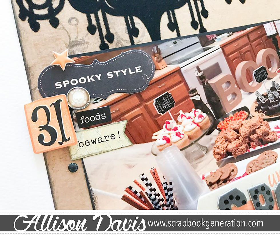
On the left page of the sketch, there is a large vertical strip behind a 6 x 4” photo. I found this great paper with the felt chandelier and spider webs and I knew it would be perfect for not only matching my photos and theme, but for a fun design I wanted to play with. Instead of using the larger 12” vertical strip, I cut a piece to match the height of the photo block and a length that would give me the same 1” margin on the left edge that you see above and below the photo block. I also moved the photo down so that I wasn’t covering the big chandelier.
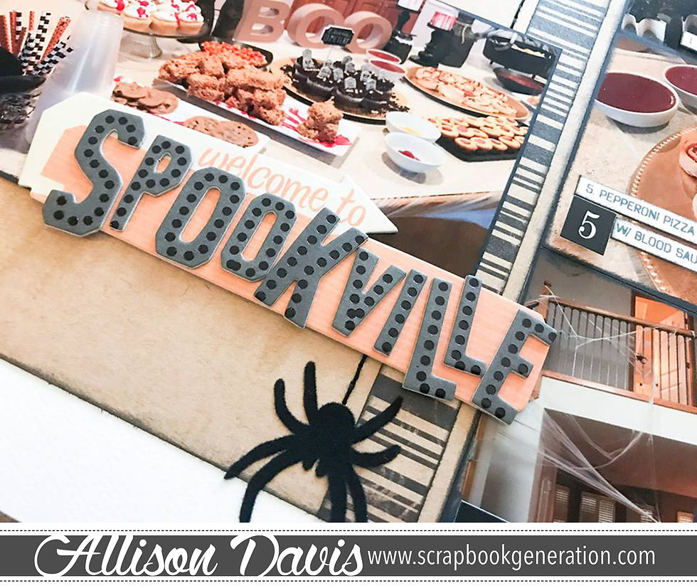
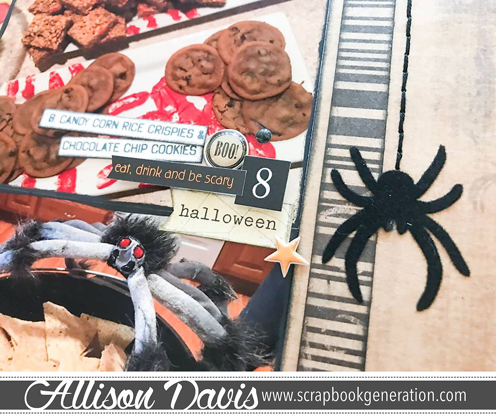
There are also three smaller vertical strips in varying lengths on top of the large vertical strip that are “dropping” down from the top of the page with a flower at each end. The look of these "dropping" strips inspired me take it to a different level to match my Halloween theme. I replaced those strips with stitched lines and spiders that appear to drop down the page.
On the right page of the sketch I added another piece of patterned paper to match the height of the photo block and a length that gives me the same 1” margin on the right edge that you see above and below the photos. A lot of times, when I’m creating a page that has all the elements grouped together in one big block, I like to have the same margins around the page to keep the page balanced.
The sketch also had a few horizontal strips going across the page, but because of the change up of design I did, I didn’t feel like those were needed so I removed them completely. I did, however, add a few vertical striped strips to the larger pieces of patterned paper.
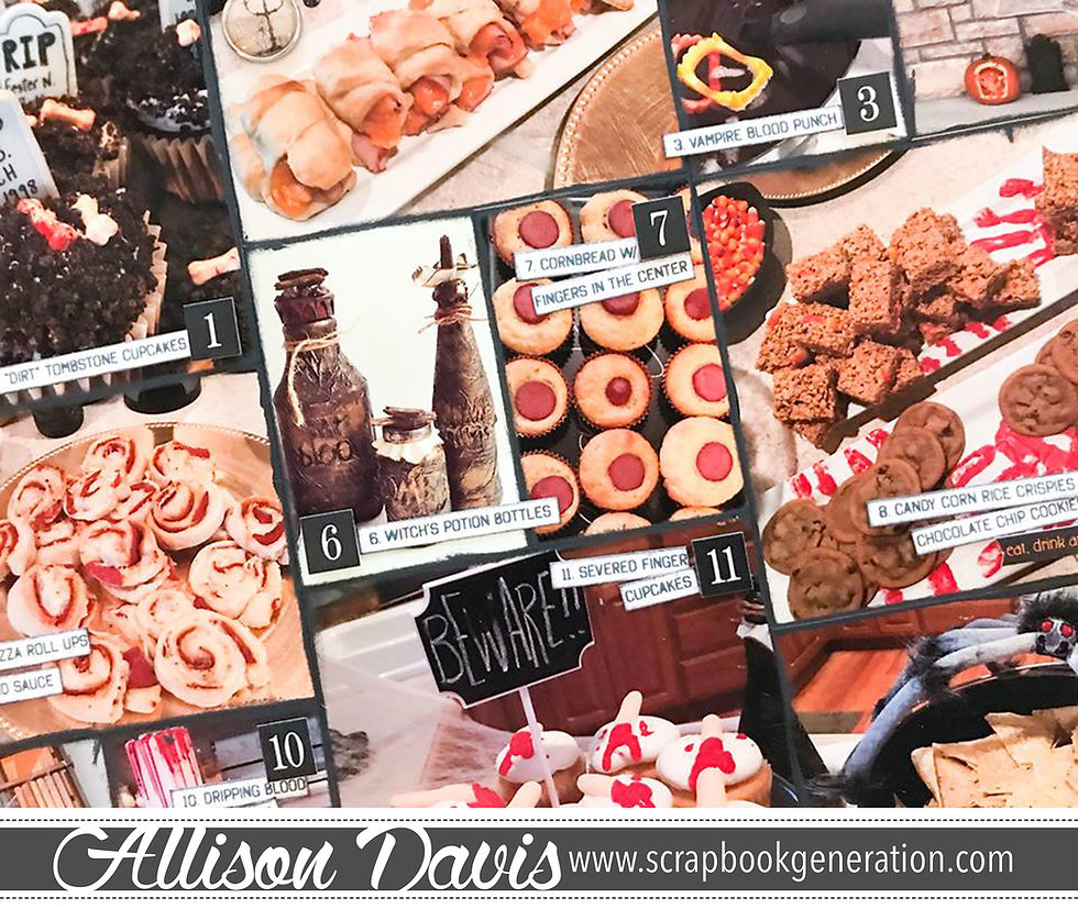
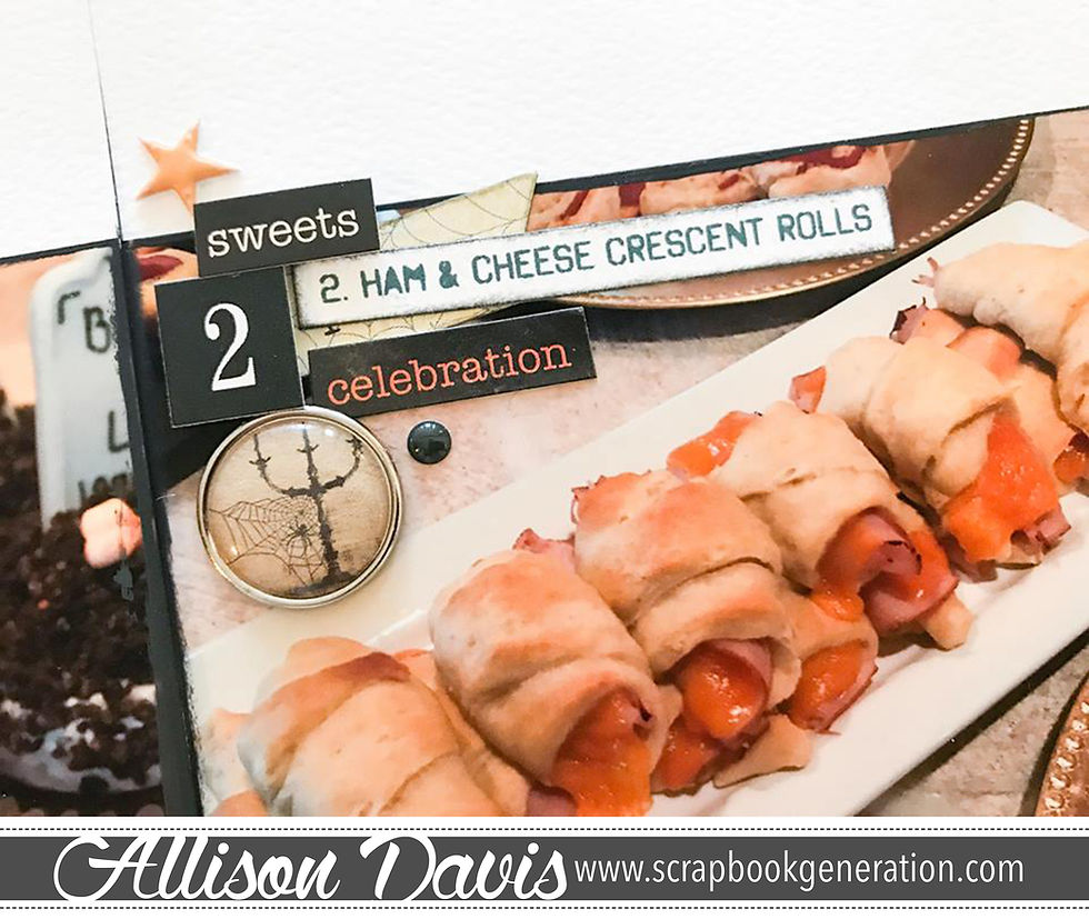
The last change I did was switching out a journaling block for journaling strips to label each picture. Creating labels for your photos makes journaling super easy! I especially like it for layouts like this that focus on all the details of an event. My pictures have a mix of decor and foods that we have at our annual Halloween party and I felt simply listing each item was the best journaling option.
The biggest piece of advice I can give to those of you that enjoy using sketches is to look at them as a guide, not a set-in-stone picture of how your layout MUST turn out. Change things up if you have to! Remove, rearrange, substitute, and most of all, have fun!

Comments