
Fun With Photo Blocks #16
- Allison
- Apr 2, 2021
- 2 min read

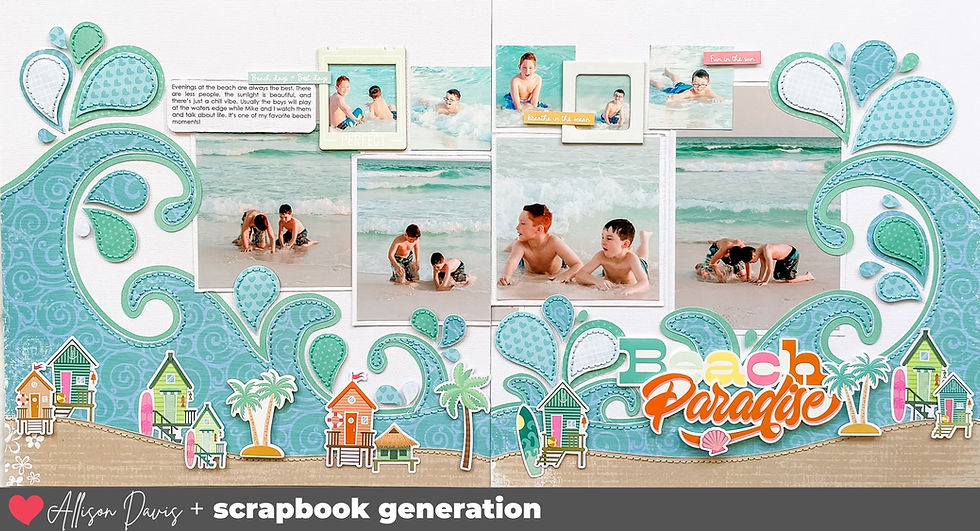
Get the best of both worlds by including more photos with a large photo block on one side of your layout while still having some fun by creating a more traditional scrapbooking design on the other.

Supplies used - Cardstock: Bazzill; Patterned paper, die cuts, chipboard, enamel dots, stickers, and brads: Simple Stories; Embroidery floss: DMC; Computer font: Century Gothic
I think one of my favorite things about this style of scrapbooking is how much more I will embellish the layouts. Because I am creating, in some sense, two 12 x 12" layouts that coordinate, instead of one 24 x 12" layout. I embellish them both as two individual layouts.
So what in the world does that mean?
Typically, when I embellish my traditionally designed layouts like the left page, I am looking to form that visual triangle to help frame bring attention to my photos.
I've got my title and journaling grouped with a few embellishments.

On the left edge of the photos (not pictured) I have a few word stickers and some little arrows. Then on the top right corner of the photos I have another embellishment grouping with a file tab, some arrow pieces, and a sticker.

On the right page, the photo block side, I pretty much throw that visual triangle concept out the window and embellish each piece of the block. It's almost like I look at each piece as it's own little layout with a different (or sometimes similar) design on each one.

On the two 6 x 4" photos I added some stickers, chipboard arrows, and die cuts to the empty space of the photos.

On the 3 x 4" card I added some hand-stitching to border the white circle and embellished it with some brads and enamel dots.

For the 6 x 12" piece, I used a piece of patterned paper that had a camera, the arrows, and the phrase "life documented" on it. I added a few details like a chipboard arrow and a brad to the center of the camera lens.

Above that I added three more photos and several word/phrase stickers.

To me, creating layouts like this are fun and give me an opportunity to create in a different format that I usually do. I highly suggest you try it sometime!
If you are looking for some large photo block design ideas, check out the Large Photo Block sketch bundles we have at Scrapbook Generation by clicking the photos below.


Want to see more? Find me on...


Last year, the folks at Ulysse Nardin took me on a historical tour of the evolution of the Freak. Twenty-three years on and the watch is still incredibly futuristic and impressive, but it's hard link to imagine the reaction when it was first released. However, link one of the double-edged swords is that the design is so refined that even with developments and aesthetic changes, it can be easy to recognize a Freak from link a glance and dismiss it as something you've seen before. How much really changed?
In Reference Points, we trace how these watches have evolved through the years, link from their earliest days to, in some cases, the present link moment. For instance, how the GMT-Master bezel insert link evolved from Bakelite with radioactive lume, to aluminum, to ceramic like the version here.
I love your sketch adaptation videos! I notice that you use a wide variety of photo sizes in your layouts. Do you print your photos at home? And if so, what printer do you use?