Sketch Support #10 | Learn How to Use and Adapt Scrapbook Sketches | Day 1
- Allison
- Jun 22, 2020
- 3 min read
Yay! It's Sketch Support time!
There's a new, FREE one-page sketch and I'm sharing five layout examples, Monday through Friday, all based on that same sketch. Then next Monday, June 29, I'll share the video version of Sketch Support.
Let the fun begin!
Here is the one-page sketch I used for the starting point of each layout I'm sharing this week.

You can download the full sketch with measurements and placements by clicking here.

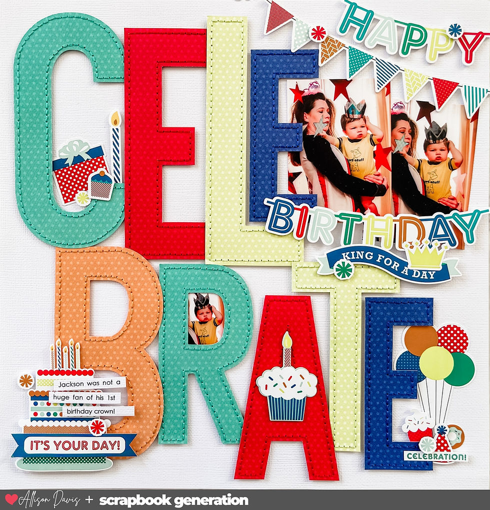
Supplies used - Cardstock: American Crafts: Patterned papers: "Feels Like Fall" Pretty Little Studio; Alphabet stickers: Pretty Little Studio; Chipboard alphabet: American Crafts; Star cut files: Alaa' K and Kristen Magee @ Silhouette Design Store; Star punch: Fiskars; Embroidery floss: DMC; Computer font: Century Gothic
The first layout stays fairly close to the sketch with just a few minor adjustments to adapt things to fit what I was working with.
Variation #1 - Rotating the sketch.
I rotated the sketch so that the photos and background are horizontal instead of vertical like they are on the sketch.
This came down to a simple reason: my photos were horizontal so I rotated the sketch to make it work with horizontal photos. This is always an easy solution for using a sketch and swapping out vertical photos with horizontal photos or vise versa.
Variation #2 - Using smaller photos.
This really didn't end up being a big adjustment, but I still wanted to point it out.
The photos I had were wallet size (2-1/2 x 3-1/2), which is slightly smaller than the photos on the sketch. I could have scaled everything down to fit that size, but a super quick and easy solution was to add a photo mat to each photo. I added a 3 x 4" mat to each photo and now my smaller photos fit the sketch design exactly as it is.
Anytime your photos are smaller than what you see on the sketch and you just aren't feeling like scaling things down to fit, try this simple solution of adding a mat to fit the size of the photo you see on the sketch.
Variation #3 - Changing elements to better fit.
I swapped out the banner strip for a straight strip. Sometimes I don't have a big reason for switching things up. Sometimes it just comes down to I simply liked the way it looked. I had already placed all of my stars and if I had been thinking ahead, I wouldn't have put as many where the banner strips overlap onto them. That way the strip would stand out more. I went a little too star heavy in those areas!

Speaking of the stars, when using this sketch or really any design that has a lot of shapes clustered together, I have a method that I follow when creating these looks. I believe I talked about it a few months ago with a layout that had a large circle design on it.

Whenever I am creating a large cluster of shapes, I will start with my largest pieces first. That largest size creates a base to build on. Then I will add in a few medium stars, then some small ones, and then I finish with a few tiny ones here and there. I feel like starting with the largest size and working my way down helps me keep balance as I arrange everything.
I also will apply a flat layer of stars and then fill in a few spots with some stars that are adhered with foam adhesive. Have different heights within a cluster of shapes always help the individual pieces stand out (literally!)
Be sure to check back tomorrow for Day 2!
Want to see more? Find me on...


I get it; the luminous star apertures aren't for everyone and may even be a bit repellent to some. For me, a bit of whimsy goes a long way, link and this star bespeckled model appeals to link my personal taste more than its streamlined and boldly minimalistic predecessor – I take being unserious very seriously. But link that's just me!–Erin Wilborn, Copywriter
While totally unexpected (at least for me), this iteration of Zenith's Defy platform starts to make more sense when you think about link it. Most people today don't realize that the Defy isn't actually a modern Zenith invention, although link it does look like it. The Defy name has real history that dates back to pocket watches produced by Zenith founder Georges Favre-Jacot in the late 1800s. Inscribed on the dial link of those pocket watches? Défi, or "challenge" in English.
Allison just letting you know the sketch link goes to a JPEG file rather than a PDF xox