
Sketch Support #12 | Learn How to Use and Adapt Scrapbook Sketches | Day 1
- Allison
- Aug 24, 2020
- 3 min read

Once a month learn how to use scrapbook sketches and adapt them to fit different styles, photo sizes, and themes. Sketches = lots of scrapbooking ideas!
A new sketch, five layouts...it must be time for Sketch Support! Yay!! I look forward to this every month. It's such a fun week.
There's a new, FREE one-page sketch and I'm sharing five layout examples, Monday through Friday, all based on that same sketch. Then next Monday, August 31, I'll share the video version of Sketch Support.
Here is the one-page sketch I used as the starting point of each layout I'm sharing this week.

You can also grab the Sketch Support #12 Bonus Sketch Examples!

This month it is a 3-page PDF of 23 different sketch options. That makes 24 sketches for this month of Sketch Support. There are options that show how to change up the papers, use more photos, use less photos, use only 4 x 6" photos, there are four two-page options, and then an 8-1/2 x 11" option. The fun part is that you could use each option as a layout on its own, but you could also mix and match different options for endless possibilities!

Supplies used - Cardstock: American Crafts; Patterned papers: Crate Paper and Simple Stories; Watercolors: Pinkfresh Studio; Circle punches: Fiskars; Bubble cut file: Ty Pilcher from The Silhouette Design Store; Nuvo Jewel Drops: Tonic Studios; Glossy Accents; Ranger; Letter stickers: Crate Paper; Embroidery floss: DMC; Computer font: Century Gothic
If there is a way to be close yet far away at the same time, this layout would be that!
Variation #1 - Using a larger photo in place of two smaller photos.
I only had one photo for this layout so I used a 4 x 6" photo in place of the two 5 x 3" photos. The height is the same for both sizes and the width is only an inch smaller. It's not a big enough difference between the photos on the sketch and the photo I used for it to require big adjustments. The only thing I changed was making the horizontal strips a little longer.
Anytime you have less photos that what you see on a sketch, you can always combine two photos into one. It's an easy solution to making a sketch work for what you have.
Variation #2 - Replacing the background papers with a different element.
I decided to remove the paper background and replace it with a watercolor background. I had this image in my head of creating a "wet" background that looked like bubbles had popped all over it.

Then I used my favorite Nuvo Jewel Drop in Sea Breeze to create little bubbles all over the background. I have some that are large and some that are teeny tiny. For the large ones I used a circle template/stencil to help me get that uniform circle shape.
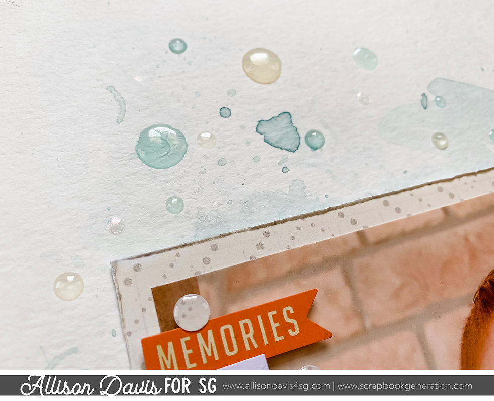
I also used some Glossy Accents to create the same effect in a different, yet still translucent color. The Glossy Accents, when dry matched the golden tone in the photo and the tone of the papers really well.
Variation #3 - Changing elements to better fit your theme.
I swapped out the stars for circles and bubbles to go with my photo. I also added in a few extra circles as well.

I have a variety of patterned paper bubbles and then several bubbles in a white patterned paper. I wanted those white ones to really stand out and take on the appearance of bubbles. I covered them in Glossy Accents to give that sheen that would make them look almost wet, like an actual bubble.

Variation #4 - Changing up the journaling format.
I ended up using journaling strips in place of the journaling block. Journaling strips are always my favorite to use so that's a substitution I make a lot. It's an easy trade off without any major adjustments needed.

That's all for day one! Be sure to come back tomorrow to see what layout #2 looks like!
Want to see more? Find me on...


This is not my first time participating in a charity auction, Lu said. "I've link participated in link Only Watch. I've participated in Children Action. This is such a historic moment; we have two super-prestigious brands that have come together to help out the environment. I think link it's fantastic."
We hope you've enjoyed The Road Through America as much as we enjoyed making it. The goal was to discover link the heart of the current zeitgeist surrounding watch collecting on America's two often disparate coasts. From the old-world vibes of the Northeast, where watchmaking in America first link took hold to the casual and sun-soaked coast of California, we discovered an endless appetite for all things watches and a deeply-seated understanding of the role watches link play in American culture old and new.