
Sketch Support #26 | Learn How to Use and Adapt Scrapbook Sketches | Day 2
- Allison
- May 24, 2022
- 3 min read

Once a month learn how to use scrapbook sketches and adapt them to fit different styles, photo sizes, and themes. Sketches = endless scrapbooking ideas with little effort. Sketches do all the heavy lifting allowing you to have all the fun!
Day two is here with water themed take on the one-page sketch! (You knew I had to work in a water page, right!?)
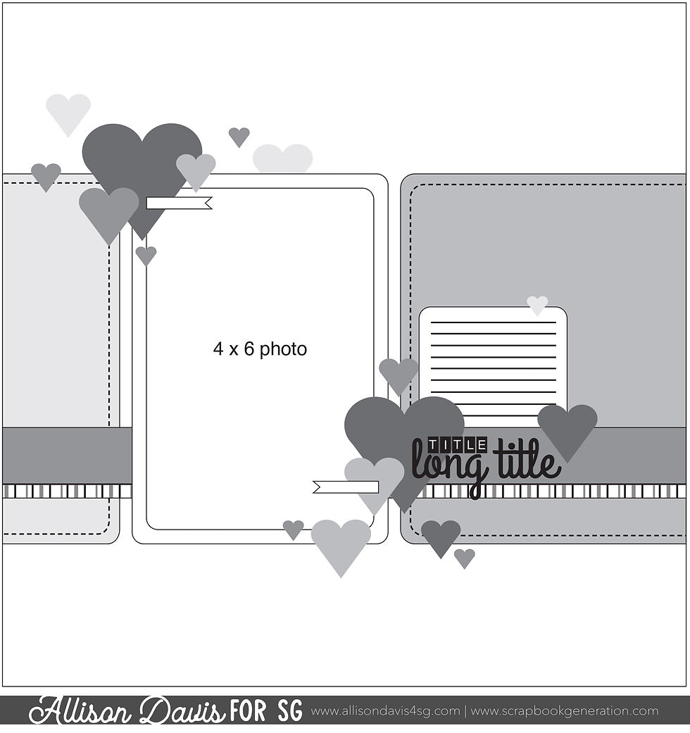
Here is the sketch that I have used as the starting point for each layout this week:
You can also grab the Sketch Support #26 Bonus Sketch Examples!

This month it is a 3-page PDF of 23 different sketch options. That makes 24 sketches for this month of Sketch Support. There are options that show how to change up the papers, use more photos, use less photos, there are four two-page options, and then an 8-1/2 x 11" option. The fun part is that you could use each option as a layout on its own, but you could also mix and match different options for endless possibilities!

Supplies used - Cardstock: American Crafts and Simple Stories; Patterned paper: Echo Park; Stickers and die cuts: Echo Park and Simple Stories; Wave cut file: Lisa Norris #63263 from the Silhouette Design Store; Droplet cut file: Amy Robison # 83594 from the Silhouette Design Store; Watercolor: Pinkfresh Studio; Nuvo Jewel Drops: Tonic Stuidos; Embroidery floss: DMC; Computer font: Golden Rule Sketch
Variation #1 - Rotating the sketch.
I was working with a 6 x 4" photo instead of a 4 x 6" photo like you see on the sketch so I rotated the sketch to help work a little better. Keeping the sketch as it was and using a 6 x 4" photo would have worked too, but it would have had less paper involved and I wanted to go wave crazy so I rotated to get the max use of the paper area. Rotating the sketch is a great way to make a sketch work with a different photo orientation that what is on the sketch. It's also a great way to get a completely different look out of sketch without big changes and big effort.
Variation #2 - Using strips in place of the background pieces.
Anytime I see any kind of larger paper piece on a sketch I always think of the different ways I can potentially break that down into smaller pieces for unique and detailed designs. My go-to ideas are generally squares, horizontal strips, or vertical strips, but there are so many more ideas than that that can highlight a specific theme. I decided to go with wave strips to match my water theme.
I really lucked out with these papers matching this photo so well because I already had these 6" waves strips leftover from another layout I had made a few months ago.

It's easy for so many patterned papers to kind of get lost in each other when overlapped like this so I tried to arrange contrasting colors together. Then to really make that wave edge stand out I added some hand-stitching in coordinating colors. Adding ink or paint to the edges would also help that wave design stand out.

Variation #3 - Changing elements to better fit the theme.
I swapped out those hearts for some beachy embellishments and some splash clusters.

I also added a smooshed watercolor background on my base cardstock along with some Nuvo Jewel Drops in my favorite color, Sea Breeze.

Want to see more? Find me on...


Acrylic crystals are such an integral part link of the design for vintage watches, says Greg Petronzi, a watchmaker specializing in vintage Rolex. "Personally, there's a charm in acrylic that you can't get out of sapphire." To Petronzi, a vintage Submariner dial can't truly link be appreciated unless it's under the right crystal, one that captures link the original intent of those who designed the watch.
Before the show started, the ladies from Mooi PR - who are in charge of all OMEGA link PR activities in The Netherlands - link handed over a small red OMEGA bag to me. Lucette (left, PR consultant) and Melissa (right, co-founder and link co-owner of Mooi PR) , thanks!