Sketch Support #26 | Learn How to Use and Adapt Scrapbook Sketches | Day 4
- Allison
- May 26, 2022
- 3 min read
Once a month learn how to use scrapbook sketches and adapt them to fit different styles, photo sizes, and themes. Sketches = endless scrapbooking ideas with little effort. Sketches do all the heavy lifting allowing you to have all the fun!
Day four is always about showing how the size of the sketch doesn't have to determine the size of your layout. Since it's a one-page sketch this month, I used it to create a two-page layout.
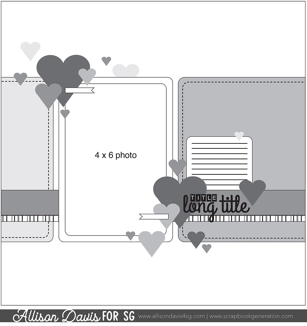
Here is the sketch that I have used as the starting point for each layout this week:

You can also grab the Sketch Support #26 Bonus Sketch Examples!

This month it is a 3-page PDF of 23 different sketch options. That makes 24 sketches for this month of Sketch Support. There are options that show how to change up the papers, use more photos, use less photos, there are four two-page options, and then an 8-1/2 x 11" option. The fun part is that you could use each option as a layout on its own, but you could also mix and match different options for endless possibilities!

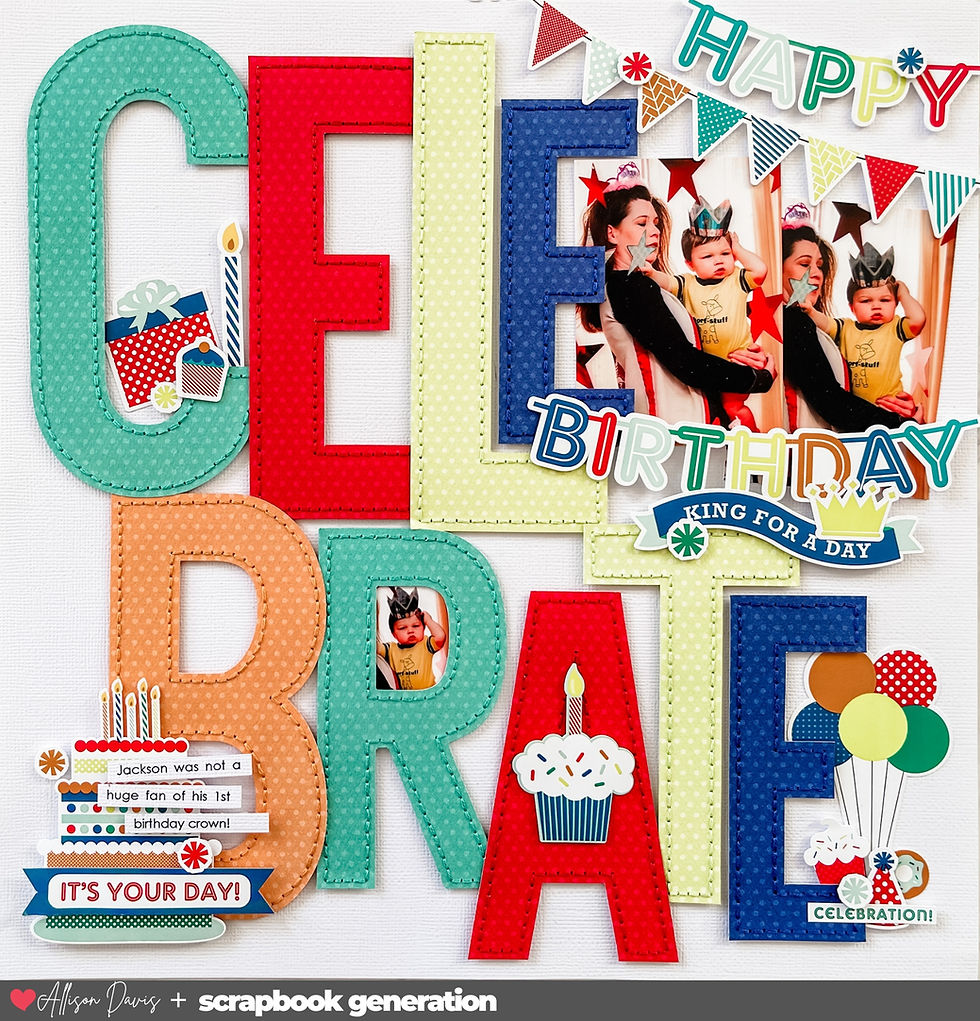
Supplies used - Cardstock: American Crafts; Patterned paper and alphabet stickers: PhotoPlay; Heart punches: Martha Stewart and Recollections; Wooden hearts; unknown; Embroidery floss: DMC; Computer font: Golden Rule Sketch
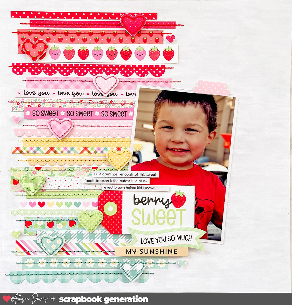
Variation #1 - Using a one-page sketch to create two-page layout.
This is one of those layouts where I took the design concept of the sketch and applied it in my own way to create a completely different look. It follows a similar concept, but it produced a different result. The top half of my layout is customized for more photos, while the bottom half somewhat follows the sketch design (with a few changes.)
Let's look at the photo design first. I had ten photos to use so I had to make some adjustments to get them to all fit. I used eight 3 x 5" photos stretching across the whole layout from left edge to right edge. For the remaining two photos I placed them below that row of photos. To me these are a stand in for the 4 x 6" photo on the sketch.
For my papers I used horizontal 1/2" strips in place of the paper pieces on the sketch. This is where I really changed it up while still applying the sketch design. Instead of having those strips framing the edge of the bottom photos, I decided to take that concept and use it with the 1/2" strips and hearts.

I arranged the strips so that there is a gap somewhere along that strip. I added a point to each end and then added a punched heart in that gap.

I tried to arrange the gaps/hearts so that I had a nice balance of them across the layout. Each patterned paper strip has one gap and heart.
To help the arrow points and the hearts stand out, I added a hand-stitched border on everything.

My title and journaling is placed somewhat closely to where it is on the sketch, near the photo(s).

I also added a little embellishment cluster on the top, right edge of the photos for a little balance.

That's all for today! Tomorrow I'll be adding the YouTube version of Sketch Support so come on back to see it!
Want to see more? Find me on...


However, over time link that changed a bit - although I still do not "get" link all of them - and I am now looking forward to Baselworld each year to see if there is link a mission patch model or limited edition in the new collection.
After link goatee-sporting watch nerd Ferdinand Alexander Porsche – designer of the first Porsche 911, and the grandson link of Ferdinand Porsche – left link the family car company, the first thing he did at the newly founded Porsche Design Studio was design the world’s first all-black wristwatch. This 1972 powder-coated chronograph (PVD was not used in the watch industry at that time) made in collaboration with Orfina, has recently rocketed from $1,500 to $4,000 at auctions.