Sketch Support #6 | Learn How to Use and Adapt Scrapbook Sketches | Day 3
- Allison
- Feb 26, 2020
- 3 min read
Updated: Mar 24, 2020
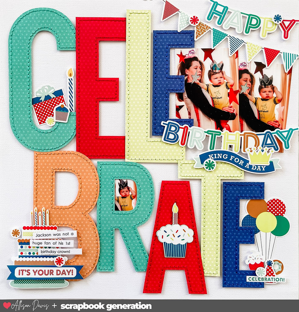
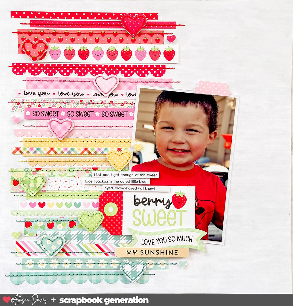
Time for another layout based on the same one-page sketch!

You can download the full sketch with measurements and placements here.

Supplies Used - Cardstock: Bazzill; Patterned paper: Shimelle, American Crafts; Glitter smile word: Pebble Inc.; Alphabet stickers: My Little Shoebox and Simple Stories; Heart punch: Fiskars; Glimmer brush: Wink of Stella; Embroidery floss: DMC; Computer font: Centruy Gothic
This was one of those experimental, let's see where this goes, kind of layout.
Variation #1 - Adding a background.
Since I used such a bright and colorful paper for my frame, I wanted to provide a break to all of that with a simple white border. I used a 12x12" piece of cardstock for my base and then cut the triangle patterned paper down a little. To me, this helped keep the colors and pattern from being too much and too overwhelming.
Variation #2 - Changing the photo sizes.
A lot of times I will have my photos printed at my local Wal-mart. I happened to notice that they have square photo print options all the way up to 8 x 8". Just on a whim, I thought, "Why not!?" and got one printed. It was sitting on my table and it hit me that it might be kind of cool if I used it with this sketch and created a frame around it.
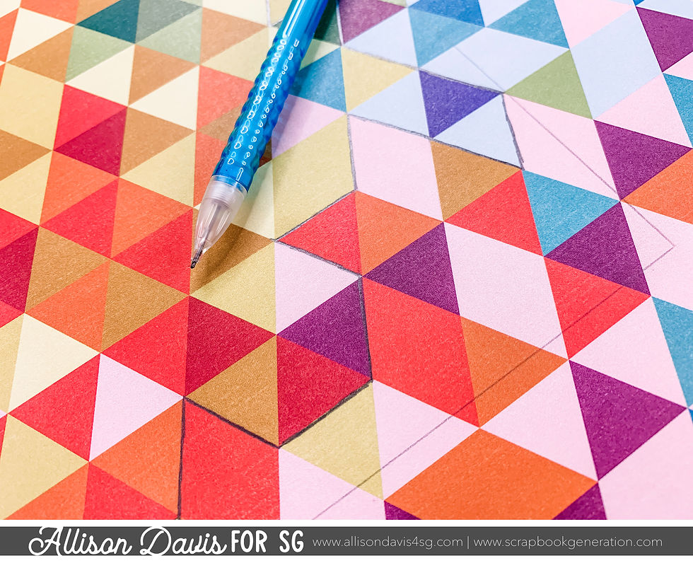
Then I came across this fun, colorful triangle paper and wanted to see if I could cut around the pattern and lay it over the top of the photo. Like I said, it was totally experimental and I had no idea if the image in my head was going to be what the end result looked like.
To start, as mentioned for variation #1, I cut the triangle paper down so that I could add a white cardstock base.
Next I used a ruler and pencil to draw the lines of where the photo would be in the center.

This was so I could see where the photo would go and plan the cuts I would make along the triangles without going beyond the photo. I wanted the photo to be the only thing showing inside the frame.
Then I used a pencil to draw around the triangles and create my frame.

I could have just started cutting, but I wanted to get a visual of what the frame would look like before I started cutting. There's no turning back once your start cutting!
Once I was satisfied with the frame, I went back over to make sure that the pencil lines were clear so I didn't make any mistakes as I cut.

When it came to cutting I used my scissors for most of it and occasionally used an Exacto knife.

After I had the middle cut out, I erased all the pencil lines. To help the frame stand out I used a nail file to distress the edges and expose the white core of the paper.
Variation #3 - Changing the embellishments.
Because this paper was so bold I didn't do a whole lot of extra to it. I kept things simple by:
• Adding a stitched border to some of the triangles.

• Cutting out a few individual triangles and adhering them with foam adhesive.
• Using a Wink of Stella glimmer brush to add some sparkle to a few triangles.

• Adding some tiny punched hearts to the center of a few triangles.
Variation #4 - Moving the title and journaling.

Since my photo is taking up the whole center of the layout, I had to make some adjustments to the placement of my title and journaling strips.
I moved the title to the right side of the photo. It's still in the same general area, below the photo, as it is on the sketch. The title was built around the giant "smile". I could not for the life of me find the dot for the "i", but I figured I don't want to cover up any more of the photo, especially near Drew's face, so I was ok with it.

I moved the journaling to the upper left of the photo. There was empty space in the photo that ended up being the perfect spot!
Check back tomorrow for the last layout!


If you think about all that, link you link will understand why, of all the complications high and low, the repeater has resisted industrialization. We have industrial versions of split-seconds chronographs and of perpetual calendars, but the repeater remains one of the last bastions of high-craft link watchmaking in which doing it the old-fashioned way is (with some caveats) still the only way of doing it.
All these models pair iconic designs with a self-winding movement. Coco Chanel (1883-1971) always said "fashion changes, but link style endures", and in 2019, the panda dial illustrates link her link words to perfection!