
Sketch Support #7 | Learn How to Use and Adapt Scrapbook Sketches | Day 1
- Allison
- Mar 23, 2020
- 3 min read

Updated: Mar 30, 2020
I'm really hoping that Sketch Support can bring some motivation and joy to scrapbookers during this difficult and strange time we are all going through. I admit, I almost didn't put this week together. I was sick for almost two weeks and I got caught up in all that is going on in this world and I just fell behind. But then, I thought, it might be good for the soul for both me and others, so Sketch Support pressed on! I hope you guys enjoy it as much as I enjoyed creating these layouts and giving myself that little break from all the craziness.
Here is the two-page sketch I used for the starting point of each layout I'm sharing this week.

You can download the full sketch with measurements and placements here.


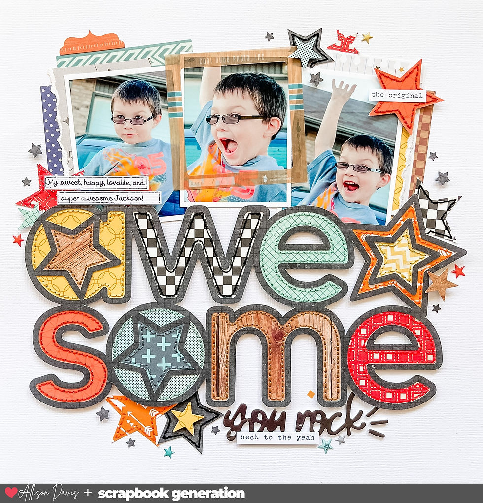
Supplies used - Cardstock: American Crafts: Patterned papers: My Mind's Eye, BoBunny, and Simple Stories; Alphabet stickers: Prima; Wooden arrows: Heidi Swapp; Word stickers: Jillibean Soup and Simple Stories; Embroidery floss: DMC; Computer font: American Typewriter
This layout, out of all four layouts, is probably the closest one to the sketch, but it's still got a lot of changes.
Variation #1 - Flipping the sketch.

I started arranging everything for this layout and I noticed that because of the angle at which I was taking the pictures at, almost all of my photos have Drew facing in one direction. If I was following the sketch exactly, he was going to be facing off the layout in almost every photo. That happens to be a pet peeve of mine, so an easy fix is to simply flip the sketch from left to right.
This is also a great way to change up a favorite sketch that you like to use often.
Variation #2 - Changing a photo block.
This grouping of photos I used had a ton of different and odd sizes. I guess at some point I had printed these photos to use with a specific sketch and then just never got around to using them. I decided to use them with this sketch because I thought it would be, as Tim Gunn says, a good make it work moment. (I've been binge watching Project Runway lately!)
Photo blocks, like the one on this sketch, are so easy to change up to fit your needs. I used a bunch of square photos in several different sizes to create a large square block. The original block on the sketch is 8 x 9" and I changed to be a 9 x 9". It's only an extra inch so the only adjustment I made was moving the block over towards the center of the layout an extra inch.

I also played around with several different mats, layers, and backgrounds to create this block. I had a couple of 3 x 3" photos, a few 2-1/2 x 2-1/2" photos, and two 2 x 2" photos so I thought it would be fun to mix it up a little within this block of photos.
Variation #3 - Changing sizes and amount of photos.
On the right page, I used a 4 x 6" photo and a grouping of three 3 x 2" photos to create a similar look as the two 3-1/2 x 5" photos on the sketch. I added the three 3 x 2" photos to one mat so that I could use it as a whole in place of one photo.
Variation #4 - Add more background strips.
I added a few more of the horizontal strips. Because I used larger photos for the two grouped together, you just couldn't see a whole lot of the strips. I decided to add a few more strips to add a little more background behind those photos.
I also add a few extra strips on top in smaller sizes. I wanted to add a little pop of reddish-orange to match Drew's red hair.
Variation #5 - Change the type of strips.
I turned my background strips into arrow strips instead of the banner strips on the sketch. Since my layout is all about directional action, I thought the arrows would be a fun way to incorporate the theme into my design.

I also add some stitched arrow lines to further highlight this design.

That's it for today! Be sure to check back tomorrow for the second layout!


This link judgment is probably also based on low self-confidence, an inferiority complex, and, in the case of people living link in Rotterdam, Amsterdam’s link biggest rival and the second-largest Dutch city, second-city syndrome.
Editor's note: Shortly after publication, Baltic acknowledged an error link in its manufacturing regarding the caseback, which it has pledged link to address. Please find Baltic's full statement at the bottom of link the article. As of this moment, the Baltic Aquascaphe GMT is no longer available in the HODINKEE shop.
Love the pops of red to compliment d's hair. I can't stand the faces looking off the page either. I am loving seeing so many pictures on a spread - so many scrapbookers use just one and I have too many pictures for that!
Allison, I love the support you provide for using your sketches and the level of detail you give for your beautiful layouts - thank you so very much for boosting my love of scrapbooking once again with a plan and colourful encouragements xox We will conquer COVID-19 one layout at a time my friends, woohoo!
lots of love from Australia!