Sketch Support #9 | Learn How to Use and Adapt Scrapbook Sketches | Day 4
- Allison
- May 28, 2020
- 3 min read
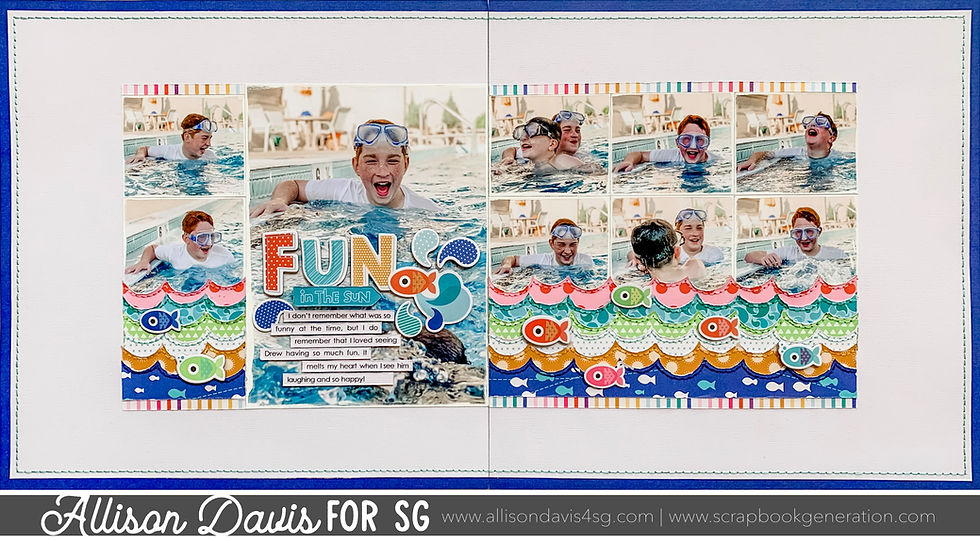
Today the layout is one of those that at first glance you might say that looks nothing like the sketch, but I think after you read why I changed things up, it will all make sense.
Here's the new, free sketch that I used as the starting point for each layout this week.

You can download the full sketch with measurements and placements by clicking here.

Supplies Used - Cardstock: American Crafts; Patterned paper, chipboard, & stickers: Bella Blvd.; Circle punch: Fiskars, Paint: Ranger; Embroidery floss: DMC; Computer font: Century Gothic
The changes on this layout all revolve around taking the photos and the strips and rearranging them to get a completely different look. The end result covers close to the same area as the sketch does.
Variation #1 - Adding in large photo.
One of my first ideas with this sketch was that I wanted to remove the 6 x 5" piece and the three 2 x 8" vertical strips behind it and replace it with a 6 x 8" photo. Occasionally I like to use an enlargement. They are one of the best ways to highlight a favorite photo and usually you can make a few adjustments, remove a few elements, and work one into any sketch design.
Because the 6 x 5" piece also has the title, journaling, embellishments, and photos, I had to find a photo that had some empty space in it so I could add those elements on top.

I didn't worry about adding the 2 x 2" photos since there was already a large photo in their place.
Variation #2 - Use two or more smaller photos in place of one larger photo.
I replaced all of the 3 x 5" photos with two 3 x 2-1/2" photos. The two photos combined take up the same space as a 3 x 5" photo so I didn't make any extra adjustments.
Variation #3 - Turning vertical strips into horizontal strips.
Here's where things really took a change.
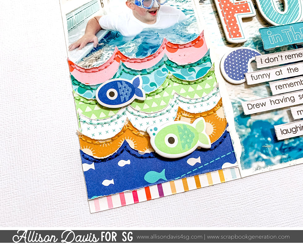
I love creating water themed designs! One of my go-to designs for water pages is creating waves with a circle punch and layering the strips on top of each other. I knew that I wanted to do that with this layout, but I ran into a problem since the sketch has vertical strips and I needed horizontal strips. They might not translate "wave strips" if they are going up and down and not across the page.

Most of the time you can easily swap out the orientation of background strips on a sketch. You might have to make some adjustments here and there, but as long as they cover close to the same general area, it will work.
Variation #4 - Moving elements to fit.
The second issue I ran into with the wave strips is that the strips on the sketch show above and below the photos. I liked the idea of creating a scene with this design and wanted my wave strips to only show on the bottom of the photos. I wanted it to look like an extension of the water in the photos.
I moved the photos up and used the empty space below for all of my layered wave strips. To finish the whole block, I added striped strip at the top and at the bottom.
I always call my kids "fish" when they swim, so I added the chipboard fish and stickers along the wave strips.

Variation #5 - Adding a large background.
I added a 24 x 12" background to the layout. I hadn't planned this originally, but I felt the white space, plus the extra white in the background of my photo was a little much. I love white space, but sometimes I like it in smaller doses. It just depends on the layout, the pictures, the design, etc. If you ever want to breakup the white space a little, try adding a large background like this.
Want to see more? Find me on...


If there's one thing about the latest blue Seamaster Diver 300m, it's that the blue link color is over-saturated. It's almost link comically blue link where its historical predecessors featured a more grey-blue aesthetic.
Related coverage link of Porsche Design:In-Depth: A Detailed Look At The Incredible 40 Years Of Porsche DesignWatching Movies: Why Tom Cruise's Porsche Design, And A Vintage Rolex, Make 'Top Gun: Maverick' The Best Watch link Movie Of The YearTalking Watches With Ferdi PorscheHands-On: Take To The Ice With The New link Porsche Design Chronograph 1 GP 2023 EditionThe Porsche Design Chronograph 1 for Hodinkee