
Sketch Support #14 | Learn How to Use and Adapt Scrapbook Sketches | Day 4
- Allison
- Oct 29, 2020
- 3 min read

Once a month learn how to use scrapbook sketches and adapt them to fit different styles, photo sizes, and themes. Sketches = endless scrapbooking ideas with little effort. Sketches do all the heavy lifting allowing you to have all the fun!
Here is the sketch that I used as the starting point for each layout this week:

You can also grab the Sketch Support #14 Bonus Sketch Examples!

This month it is a 3-page PDF of 23 different sketch options. That makes 24 sketches for this month of Sketch Support. There are options that show how to change up the papers, use more photos, use less photos, use only 4 x 6" photos, there are four two-page options, and then an 8-1/2 x 11" option. The fun part is that you could use each option as a layout on its own, but you could also mix and match different options for endless possibilities!

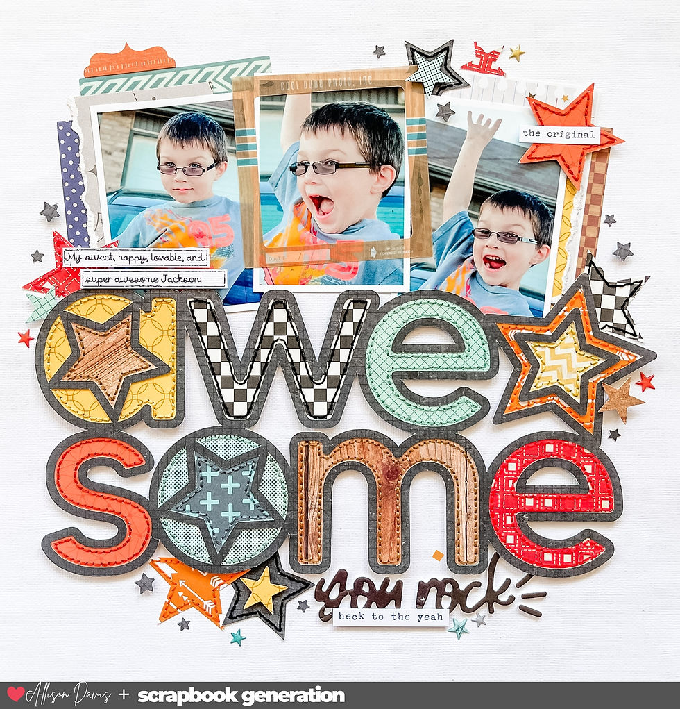
Supplies used - Watercolor paper: Fluid Watercolor Paper; Patterned paper: Echo Park; Mood cut file: Paige Evans from The Silhouette Design Store; Watercolors: Pinkfresh Studio; Star punches: Recollections; Stickers: Simple Stories; Chipboard pieces: Echo Park; Glitter: Stickles; Embroidery floss: DMC; Computer font: Century Gothic
Variation #1 - Replacing the circles with different elements.
I've had this "love you to the moon" cut file for awhile, just waiting for the perfect layout. Then this sketch came along and I knew it was just what I was looking for.
I really wanted to play with that moon theme of the die cut so I combined it with some watercolors to create the circle that you see on the sketch.
I added a circle base with watercolors first. To get that perfect circle I used a large chipboard circle as a template. I laid it down on the paper and painted around it. Then I remove the chipboard circle and filled in the rest. I used a combination of three different blues to get a good blend of color - a light blue, a dark blue, and an aqua blue.
After that base circle was dry, I added watercolor to the brush and flicked it around the edges.
I cut the moon out of a yellow patterned paper and layered it on top of a multi-colored star paper. The yellow paper and the words just weren't standing out as much as I had hoped so I turned to my all-time favorite technique, hand-stitching. I used a much darker, it's actually almost an orange, to really define the edges of that yellow die cut and make those words stand out.

Variation #2 - Using a large photo in place of smaller photos.
I used a 4 x 4" photo in place of all three of the photos on the sketch. I only had one photo to use, plus the larger die cut piece took up some extra space in the circle, so that one photo was just what I needed. Between the large die cut and the larger photo, it covers close to the same general area as the three photos on the sketch do.
Variation #3 - Changing elements to fit your theme.

Because that yellow die cut moon is so big it pretty much takes the place of the bottom left cluster. I didn't want to add too much to it since it's already got a lot of detail so I added a few stars and chipboard animals to it.

In top right corner I added a chipboard cloud and some more stars.

To help all the stars stand out I added some glitter on top of them.
That's all for day 3! Check back tomorrow for the last layout of the week!
Want to see more? Find me on...


And so was born the Arceau watch, designed by Henri d'Origny, who later went on to design the Cape Cod in 1991. D'Origny was also the creator of "Mors et Gourmettes," one of Hermès' most famous scarf prints. link He designed across categories, drawing on the link brand's equestrian roots and link house design codes – the Arceau features asymmetrical stirrup-shaped lugs, the Cape Cod composed of two Chaine d'Ancre half-links and "mors et gourmettes," which quite literally means "horse bits and curb chains."
As a token to Tudor's past in supplying hardwearing dive watches to various elements of the U.S. Navy, while the new FXD isn't link directly issued, it does link possess the connective tissue in a manner that feels aligned with the brand's history while ensuring that the FXD is a modern tool watch link for diving.
Absolutely adorable! I literally said “Awwww” out loud. Alison thanks for sharing your talents. Your journaling is just perfect too!